Monday 30 January 2012

RIP: Atlanta Thrashers

I'm hoping the wounds have healed for anyone who was or is a Thrashers fan, wait who am I kidding I'm a Canadian and everyone I know was super stoked that the Jets came back to Winnipeg, but thats a different post all together.

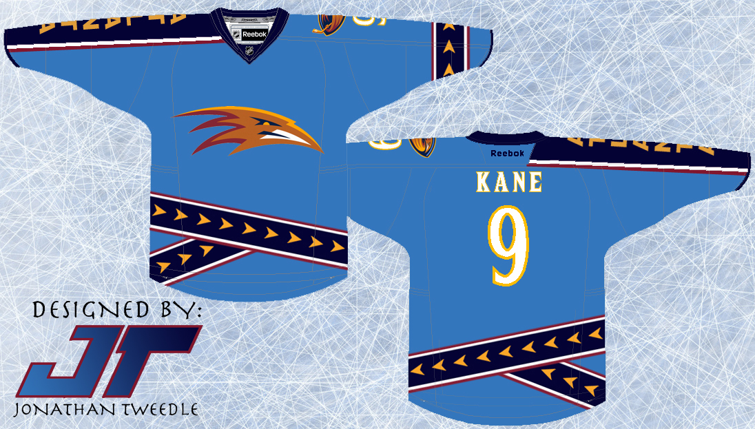
Back in 2004 when I designed this jersey the Thrashers still existed so it was relevant at some point.  As you can see the design is very similar to the 3rds the thrashers used back in 2003 and then turned them into their primary jerseys shortly after that.  BUT, it is different, first off the text spelling "ATLANTA" is on the opposite are, 2nd the logo in the middle is different.  Also the striping with the arrows is much different on the bottom as I've tried to bring it to life by angling and layering the pattern, as well I've added the arrow striping onto the other arm.  Although it is still very similar to the actual jersey I still really like it and tried as best I could to make it different enough.


A Shout out goes to my buddy Jeff who was my partner in crime when I started making these jersey concepts back in 2003.  He sent me an email a few weeks back and turns out we had actually made the Thrashers jersey Orange, so here's how it was supposed to look....BLUE LOOKS BETTER!


Original Concept from 2004:


Friday 27 January 2012

Striking Intimidation into the eyes of their opponents: Panthers

This jersey design is quite simple, I wanted to make the florida panthers look more like a team to recon with instead of being seen as just another failed attempt to bring hockey to the deep south.  Simply put I made the striping for the jersey look like claw marks, a simple change but I think it proves its point.  Hope you guys enjoy!


Original Concept 2003:


Monday 23 January 2012

The Music City Predators

The Nashville Predators have had a history of very....interesting jerseys. with the random silver, yellow, white, and navy they had created some very interesting threads.  Oh and I forgot to mention the diarrhoea yellow 3rds the sported for a couple of years.

My original concept for the predators uses the skull logo that the press have had on their shoulders for a number of years, I personally think this logo is pretty awesome so why not use it on a jersey.  The rest of the jersey is kind of random though.  I think what I was thinking in 2003 when i drew this jersey was that if I was using the skull logo then I could make the rest of the jersey look archeology/museumy to add to the character of the jersey.  Welp, here it is, after I made the jersey it started to grow on me, check it out;


Original Concept from 2003;


Friday 20 January 2012

You be the Judge: Islanders Jersey

DISCLAIMER: All (with the exception of the rebranded ducks and capitals 3rds) of my jersey concepts thus far were originally created 8 years ago, and as I'm taking a look back I'm thinking about some of them "What was I thinking?!", and this Islanders jersey is one of them.  I am not claiming that these jerseys are all amazing and I'm still up in the air about this one

At the time I created this jersey the Islanders had JUST got rid of their ridiculous fisherman logo and went back to the old school NY logo.  At the very least I decided that instead of the fisherman the Islanders could use the shoulder patch that was on those jerseys, a lighthouse.  At least the lighthouse doesn't look at random as a fisherman, I mean if you stretch it out a bit, when you think of an island you would think of a lighthouse before you thought of a fisherman.

I've also made the striping wavy to give it that islandy feel and to pay homage to those ridiculous fisherman jerseys that sported a similar, but not as polished wave design.


Original 2003 Concept:


Thursday 19 January 2012

What exactly is a Bruin?

A long time ago, in a galaxy far, far away, oh wait, nope scratch that... Back in the day, or at least it seems like back in the day, the Boston Bruins had a yellow 3rd jersey sporting a gentle looking bear on the front, intimidating I know right?!  In 2004 when I originally made this concept I decided that the Bruin on the front of the jersey needed to look meaner, strike fear into the eyes of their opponents not make them want to take them home and snuggle up nice and close to it on a cold winter's day.  Back when I made this jersey (8 years ago) I found this really angry looking bear and drew it on the original concept as you can see, when I re-created this jersey I couldn't find that image anywhere on google, I mean come on eh?!  Needless to say I found a new logo that still looks pretty awesome and added some unique features to the jersey.  At the bottom I simplified the original 3rds the Bruins used into what I would argue looks like a bear paw/claw print, at least I hope thats what it looks like.  I then added some slash marks to add some character to the jersey and overall I must same I am very pleased at how it turned out.


2004 Original Concept:


Monday 16 January 2012

Comments

So I just realized that I keep telling everyone to comment but you can't unless you have a blogger login.  I've fixed that so now anyone can comment, and please do! I want to hear from you guys! :D

Tweedle

Friday 13 January 2012

New Avalanche 3rds

I have to admit I have always liked the Avalanche logo.  As plain as the letter A is, they decided to spruce it up and create a scene incorporating the letter.  Too bad they didn't take the same creativity into making their current 3rd jerseys.  I mean, having the word Colorado diagonally down the front of a jersey and changing the colour scheme, how original!  If you are going to change the colour scheme at least do something cool to the rest of the jersey, like this;


That Big foot logo has been around for as long as the Avs have been in the league, so why not put it to good use?!  I've also tried to incorporate the unique striping the Avs use to circle their logo; as you can see the oval surrounding the foot is much more than slapping a random oval to encompass the logo.  I have taken the same theory and applied it to the white accent striping of my concept, I believe adding a very unique, genuine Avs feel to the concept.  I've also included my original concept of this jersey and as you can see I have added the coloured shoulders because when I created the jersey without the purple shoulders the jersey looked a little bland, enjoy.


Thursday 12 January 2012

My First Blog

I love hockey, always have, always will. And for those of you who know me, hockey jerseys have always intrigued me. If I could, I would buy every NHL jersey known to man and then some. But my obsession has grown into something more, having jerseys isn't enough, I want to create them too.


It all started in grade 11 math class. My friend Jeff and I somehow got into talking about how cool it would be to design our own NHL jerseys and then sell the designs to the league and become millionaires, all while not learning the quadratic formula. I began to research, design and draw new jerseys for each NHL team, a collection which I just recently rediscovered a couple of weeks ago. Flipping through my drawings I discovered that a handful of my designs are VERY similar to jerseys teams are using now, drawings that I made in 2003, years before these jerseys were used by NHL teams, NO BIG DEAL! I can't take all the credit though, a big shout out to Jeff Uhlman, because we were both designing jerseys when we were supposed to be doing math problems.


But beyond that I had a ton of fun drawing these designs and creating new ideas to make these jerseys come to life. More recently I have been able to feed my addiction through creating teams in the EA Sports NHL series, as well as following an amazing jersey blog site "Icethetics" (check it out, its phenomenal). All of this has led to this blog; Got a new mac about a month ago and now have photoshop, 30 jersey designs, and many more new ideas that I want to share with the world, or at least my friends.

I'm hoping the learning curve is quick working with photoshop so hopefully my first few concepts aren't too amateur looking.

Enjoy!

Tweedle

Still learning the ins and outs of blogging

So originally my plan was to put all my original concepts onto a separate page and organize all my concepts by team.  However, after trying to figure out how I would go about doing that I discovered that it just doesn't work that way, any time I post something it goes straight to the main page.  So, that being said I came up with a brilliant plan to include the original hand drawn design from 2003 when I post that same concept that I've created in photoshop.

Which means the first couple of posts are going to be republished with the original concepts attached.

Wednesday 11 January 2012

Capitals 3rd Jersey


Ever since the capitals switched to their new style of jersey when the reebok edge jerseys came out, I've been a huge fan of them.  Other than the winter classic jerseys they use occasionally the caps don't really have a 3rd jersey anymore.  Year after year I've been waiting in anticipation for the caps to unveil their 3rd jerseys with the eagle on their shoulders as the new primary logo.  It hasn't happened yet, so I took matters into my own hands and decided to design it for them.


Monday 2 January 2012

The Return of the Mighty Ducks of Anaheim

I didn't realize how much I liked the maroon and greenish/teal jerseys the Ducks wore until they were gone, good times and many memories (D1, D2, D3 was a huge part of my childhood).  The ducks NEED to bring back the Wild Wing logo ASAP!  Other than that I switched the colours around but kept the same retro design.


Original Concept From 2003: