Thats the only catchphrase I could think of so early in the morning so I apologize. But seriously, to compliment my Captain America jersey I have been working really hard at developing this Iron Man jersey.
Simply put I've used Iron Man's mark VI suit as the framework (as seen in Iron Man 2 and the Avengers) and have added various elements from other suits to make this jersey a little more unique.
So Many layers, so much time spent on this one, what do you guys think?
Friday, 25 May 2012
Monday, 21 May 2012
Avengers Assemble!!!!!
This is completely out of the ordinary, I've never done this before but after watching the Avengers on opening day and basking in the Epicness that was Avengers, I just had too.
Ladies and Gentlemen, my Captain America jersey!!!!!
When I was telling my friend Rodney that I wanted to make it he was sceptical because he thought it would look cartoony, so I vowed to him that I would only move forward with it if it looked LEGIT, and I gotta say, not to pat my own back or anything, but this looks pretty legit if I do say so myself.
I've taken the 2 Captain America costumes that Chris Evans wears in Captain America and the Avengers and have combined them into this design. Instead of make a red white and blue jersey and sticking stripes on it I decided that in order to make it look legit I needed to add texture to the jersey, make it look like Captain America's actual body armour, and here is what I came up with:
PLEASE TELL ME WHAT YOU THINK, if it's any good I'll try my hand at other "outlandish" concepts like this one, if it sucks, I won't harm your eyes with anymore super hero jerseys.
I do have an Iron Man concept in the works, check back on Friday to check it out.
Friday, 18 May 2012
Creating a Canadian Identity: Part 3
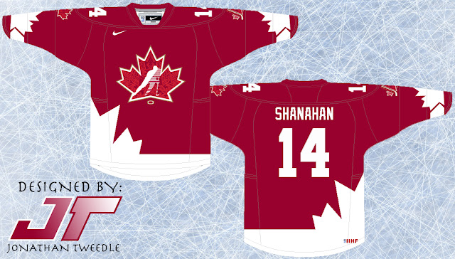
As promised I've been working on a few alternate jerseys for my new Team Canada rebranding. I've made 2 black alternates and 1 red alternate. The first black alternate its pretty straight forward and is a variation of the home and away jerseys I posted earlier, with a little gold trim.
The 2nd black jersey is much more out there, taking a variation of the 2006 Torino jerseys and adding some flare with the Maple leaf.
Finally, the Red alternate takes the Maple leaf look and gives it a classic, 70's feel to it.
In all 3 concepts I've created a variation of the Hockey Canada logo and blended it with the 2010 Vancouver logo, enjoy:
New Hockey Canada Logos:
Monday, 14 May 2012
Creating a Canadian Identity: Part 2
As promised I've been working hard on making jerseys for my new Team Canada logo, and while there is nothing ground breaking or new today, Friday I'll be posting 3 alternates I've been working on that are a little bit more unconventional.
The new home and away uniforms I've posted are the same design Canada has been using since 2009, and the design is simple and sharp, the new logo looks like a natural fit on these jerseys.
You will also notice the names on the back of the jerseys are from the 2002 Olympic team because let's be honest, that team was SOLID!
Friday, 11 May 2012
Creating a Canadian Identity: Part 1
Where was I 4 years ago when it was announced that Team Canada would not be allowed to wear their jerseys they've been wearing for 15+ years at the 2010 Olympics because It was promoting Hockey Canada which apparently isn't allowed, who knew. That being said Team Canada was looking for a new logo to represent and it looks pretty sweet.
But If I had have come up with this logo 4 years ago when they were looking for a new logo maybe they'd be wearing sporting my sweet logos instead, needless to say, I'm pretty pumped about how they turned out.
In true Tweedle fashion I have tried my very best to incorporate the history and essence of what Team Canada is all about.
The Primary logo combines elements of a number of logos Canada has used in the past;
NEW Primary Logo:
I've also made versions for both the home and away jerseys:
Home:
Away:
I'm also working on 2 more logos that are a mash-up of the current Hockey Canada logo, 2010 Olympic logo, and the 88-95 Hockey Canada logo. Check out Chris Creamer's sports logo's website to see all the logos I've used in this new one: http://www.sportslogos.net/team.php?id=1646
I'M IN THE PROCESS OF MAKING 5 DIFFERENT TEAM CANADA JERSEYS, I'll be posting them next week, be sure to come back and check them out.
Friday, 4 May 2012
Letters to the President: Washington Capitals
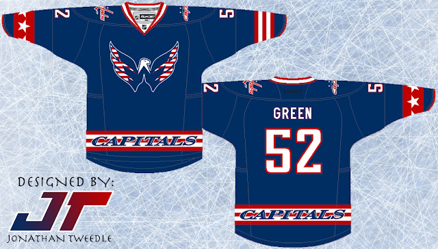
Did you guys know that the bottom of the Eagle logo the caps use is shaped like the top of the white house?!?!?!?!?!?!?! I didn't until like a month ago and when I figured it out my jaw dropped. My brain also started racing thinking how I could make a new logo with that in mind. That new logo will drop in a new rebranding series I'll be starting shortly, until then I've made their current eagle a little more patriotic, after all it is the Nations Capital.
In terms of the jersey I've tried to make it as, US capital-ish as possible and I think it works.
This is my last 2003/04 concept which means that from here on out we are journeying through unchartered territory:
Original Concept From 2004:
Subscribe to:
Posts (Atom)


