Showing posts with label Original Concepts. Show all posts

Friday, 4 May 2012

Letters to the President: Washington Capitals

Did you guys know that the bottom of the Eagle logo the caps use is shaped like the top of the white house?!?!?!?!?!?!?! I didn't until like a month ago and when I figured it out my jaw dropped.  My brain also started racing thinking how I could make a new logo with that in mind. That new logo will drop in a new rebranding series I'll be starting shortly, until then I've made their current eagle a little more patriotic, after all it is the Nations Capital.
In terms of the jersey I've tried to make it as, US capital-ish as possible and I think it works.

This is my last 2003/04 concept which means that from here on out we are journeying through unchartered territory:


Original Concept From 2004:


Friday, 27 April 2012

Colour Confusion: Vancouver Canucks

Of all the teams that have rebranded themselves over the course of their history  the Vancouver Canucks have had one of the most drastic changes.  From starting off with blue white and green, then to the infamous yellow black and red, they then switched to navy maroon silver and a lighter blue and have just recently gone back to the green and blue.
Back in 2003, when I first made this design, the jersey was relevant: the Canucks were still using the navy maroon silver and a lighter blue colour scheme and I threw on their original logo (before they started using it again I swear!).  In hindsight, I would say this jersey is pretty sweet, if they still used those colours:


Original Concept From 2003:


Monday, 23 April 2012

It Pain's me to do This but Here Goes Nothing: Toronto Maple Leafs

For those of you who don't know me I grew up in Ontario, just outside of Toronto and I AM NOT a Leafs fan!!!!!  So it will probably come as no surprise that when I was flipping through my original concepts there wasn't a drawing for the Toronto Maple Leafs, shocker!!!

BUT, my buddy from high school who designed these jerseys with me was a huge Leafs fan and a couple of months ago he sent me the jersey he created for the Leafs, so all the Leafs fans out there you should be thanking Jeff!

Jeff's design is on a template that can be imported directly into an EA Sports NHL game for PC, which was the original purpose for creating these jerseys.  From this drawing I've re-created Jeff's design into the template I've been using to give you a better idea of what it would actually look like if it was ever produced.  BIG shout out goes to Jeff!!

Jeff's Design:

My Version of Jeff's Design:


Friday, 20 April 2012

Flashes of Genius...Flashes of Lightning

I take pride in the designs I make, and I'd like to think that I do a pretty good job too.  And I've got to say, this new Tampa Bay lighting jersey is one of the best I've done and there is ALOT going on in it.  First off, and most obviously the lightning bolts on the sleeves are freaking AWESOME!!!!! my original drawing from 2003 looked pretty bland so I decided to bring it to life, and I think it worked.  You'll also notice the lightning stripe on the bottom of the jersey which completes the look for sure.
Finally, and this one is a bit more subtle, if you look closely, you'll notice I've created a new logo for the lightning.  I've combined many different elements of past lightning logos to create this, what I think, i a pretty sick logo....3rd jersey's anyone?


Closer Look at the New Logo:


Original Concept From 2003:


Monday, 16 April 2012

Feeling Blue? Hope This Brightens Your Day!

I can honestly say I have no idea what I was thinking when I designed this jersey back in 2003.  The wavy striping on the sleeves to the best of my memory are completely random.  And as a whole the jersey design itself looks pretty similar to what the Blues where now, but it does look pretty sweet I think.  The logo used to be used as a shoulder patch by the blues back when the still had red in their colour scheme, I've updated the colours and overall I'd say it looks pretty good:


Original Concept From 2003:


Friday, 13 April 2012

Shark Attack!!!

The San Jose Sharks have held so much potential with their logos and jersey designs since they entered the league.  When they updated their logo and jerseys they had even MORE potential!!

My design, is easily my favourite design to date, but it didn't look this good back in 2003 when I first drew it.  As you can see from my original drawing the concept is the same but the end result is much different.  I tried to add the multiple shark fins on the bottom and sleeves of the jersey and it looked like a 5 year old child made the jersey so I scrapped that idea.
And boy am I glad I did, as you can see I've come up with something much more awesome, well actually 3 designs of awesome because I am so indecisive.
The first is the original Fin logo in the middle, the second has the updated fin logo and the new orange the sharks introduced into their arsenal a few years back.  And finally, and I think my favourite of the three is the hybrid, which has taken elements from both jerseys and perfected the design, enjoy!

Original Fin Design:


Updated Fin with Orange Design:


Hybrid Design:


Original Concept From 2003:


Monday, 9 April 2012

The End of the Passive Penguin

The first thing you'll notice with my Penguins jersey is the new design on the jersey itself.  I can't say I remember what I was thinking when I made the design back in 2004, but I improved it and personally, I think it looks pretty sweet.

What you might not notice at first glance is that I've changed the logo.  The first thing I've done is, change the direction the penguin is facing, usually he is facing the left but I've got him facing the right.  Secondly, and this is the focus of the new logo, is that I've got him taking a slap shot.  What I'm trying to do is make the penguin a little more intimidating instead of just skating around with his stick on the ice.  It may not be a huge difference but for me, I think it makes the logo a lot more awesome, just saying:


Slap Shot Penguin Logo:


Original Concept From 2004:


Friday, 6 April 2012

Reviving an Old Mistake: Phoenix Coyotes

Do you guys remember the Coyotes 3rd jersey back in 98?  (If you don't check them out, my post will make a lot more sense) The green ones with the mural on the bottom and sleeves?! pretty.....awesome?....awkward? I don't know what the word would be to describe them.
BUT!!!!! there is hope, I've updated the design and added a little Tweedle flare to it.  I've kept the desert mural on the bottom and sleeves but I've updated the colour scheme so the colours don't clash as much.  I've also taken the moon logo the coyotes have had at their disposal and added a coyote howling at the moon.  I gotta say, I really like this jersey!


Coyote Howling at the Moon Logo:


Original Concept From 2003:


Monday, 2 April 2012

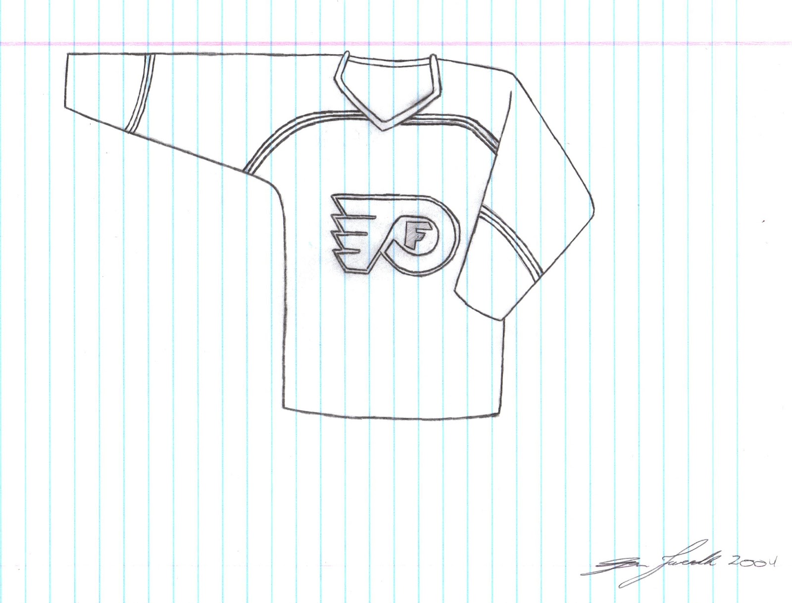
Is it Always Sunny In Philadelphia?

I guess I wasn't feeling very creative back in 2004 when I made the original design for this Flyers jersey.  While Yes, I slightly changed the logo and added an F for Flyers within the flying P logo the design itself is not much different than what they actually wore back in 2004.  I didn't want to cop out and use the same colour scheme they actually use so I switched the black and white and I'll be the first one to admit....this jersey is kind of MEH!

This is a Tweedle guarantee, next time I make a Flyers jersey it will be MUCH better, already have some ideas for a new logo that includes the Liberty Bell and pilot wings....


Original Concept From 2004:


Monday, 26 March 2012

I See Your Stars and Stripes and I Raise You Some Canadian Heritage: Ottawa Senators

I must have designed the Rangers jersey and the Senators jersey pretty close together cuz both of them scream patriotism to the max!  This Senators jerseys sports the shoulder patch the Sens used to wear with the parliament building crested together with a maple leaf.  From there I decided to use the maple leaf as the focal point of the rest of the jersey; putting it on the bottom of the jersey and the sleeves.  While it looks a bit cluttered I like how it turned out:


Original Concept From 2003:


Friday, 23 March 2012

The Star Spangled Jersey Project: New York Rangers

Alrighty, you ready for this?  This could be the most American jersey known to man! And although Washington D.C is the capital of the States, New York is definitely the most well known city and people usually associate New York when they think of the States.
So, as you can see I've made this jersey as patriotic as I possibly could and to be honest, it turned out ALOT better than I thought it would.  Don't think I need to explain much beyond that but I did make it so that (including the back of the jersey) there would be 50 stars on the jersey just like the flag, Enjoy!


Original Concept from 2003:


Monday, 19 March 2012

Finally, Some NEW JERSEY's for the DEVILS

See what I did there?! Clever huh...

But seriously, the New Jersey Devils have had the same jerseys (pretty much) since the early 90's and before that the only real difference before that was that instead of black the Devils dawned the green to...compliment?....the red and white.
So with that in mind take a look at my new concepts: First off I've changed the logo just a bit, and now we have both the letters N and J separated styling some devilish features.  And the jersey itself, I'm pretty sure if I can remember back to 2004 when I drew the concept is just kind of random.  Doesn't really have any significance to the club but it looks pretty cool.

Which one do you like better; the Red or the Black?

Red Concept


Black Concept


New NJ Logo:


Original Concept From 2004:


Monday, 12 March 2012

A Mediocre Monday Afternoon Montreal Design

The Montreal Canadiens jerseys, are a classic, since the 70s their jerseys have changed very little.  That being said when trying to figure out what to do with the Habs 8 years ago I didn't really have any ground breaking ideas and to be honest, what I came up with, to me is only "meh".  And I promise that when I design a new tabs jersey after I make it through all my 2003-04 design it will be much better than this one, PROMISE!


Original Concept From 2004:


Friday, 9 March 2012

The WILD West: Seriously, This Jersey is Wild!

Let me reiterate the fact that I don't claim to think all of my jersey designs back from 2003 are amazing, in fact this one is quite "unique" and I don't even really think I like it that much.  Although I made an updated version of it without a key element and it looks much better but I have to show you both designs so you can see the difference.
As you can see I've taken the trees from within the Wild logo and put them at the bottom of the jersey creating a Phoenix Coyotes like "Mural Jersey" although the trees look pretty cool I think.  Then I've taken the text "WILD" and put the outline on both sleeves to add some more character to the jersey.  Finally you will notice an awkward triangle-ly striping thing at the top that I don't really like.  It makes the jersey look like it has a cape, weird, so I took it out of the 2nd design and I think the jersey looks way better without it.
 One thing I really DO like is the black, WILD logo and when I start making new designs for each team I think I will be bringing this bad boy back!  Enjoy, or, throw up, which ever one comes first after seeing these jerseys:

Design With "Cape Stripes"


Updated Design Without "Cape Stripes"


Original Concept From 2003:


Monday, 5 March 2012

Putting Some Purple Back into the Kings Repertoire

This jersey is pretty out there, I'll be the first to admit it.  And I never claimed that all my design were awesome.  I find myself on the fence about this particular one.  One thing is for sure, I do think the kings need to bring the purple back, maybe not THIS much purple but when I get the chance to make a new kings concept I'll definitely be using purple as an accent colour for sure!
The design itself is pretty random, don't really remember why I made random circle thingy's on the sleeve to be honest, but the kings on the bottom is a tribute the their old black and purple jerseys that said "Los Angeles" on the bottom.  And the 2 crowns on the bottom of the sleeve, well come on, that just looks sweet!  The logo is an alternate logo the used to use, and I think it looks pretty sweet if I do say myself! anyways hope you guys enjoy!


Original Concept From 2003;


Monday, 27 February 2012

Re- SPAWN-ing an old look for the Oilers

Let me start this post by saying that The Oilers 3rd jersey from 2001-2007 was the COOLEST jersey ever!! when it first came out I thought it was the most awesome jersey of life, I still love it, in fact I have a Oilers 3rd Jersey with Mike York on the back....yes Mike York, please don't ask me why I have a Mike York jersey lol but I love the oilers 3rd from 2001!!!
Oh and for those of you who also don't know the logo used on that jersey was designed by the creator of Spawn, hence the post title.
Anyways when i created this design it was because I really wanted the Oilers to rebrand and use the 3rds as a primary jersey and my design as their away jerseys.  And to be honest I still think they should use that jersey combo, the retro jerseys are cool but come on, these ones are original, the retros had their glory days back in the 80s.
I took part of the shoulder logo from that 3rd jersey and made it the primary logo and kept it pretty simple for the jersey striping, hope you guys enjoy!


Original Concept From 2003;


Friday, 24 February 2012

Putting the Star Back in the Lone Star State: Dallas Stars

When I first made this concept back in 2003 it was a pretty simple, not really unique idea.  Reverse the colours from the Stars home jersey and use the Texas shoulder patch as the primary logo, pretty simple and straight forward.
But today it is a little more original then when I first made it 9 years ago.  Since the Reebok Edge jerseys came out a while back Dallas completely changed their look.  From having a very specific look with the Star jersey they switch to a very plain "modern look" and aren't even really using their logo very much either, they've replaced it with "DALLAS" along the front in very simple text.
So, here it is, bringing back the old school with a little swappage of the colours, enjoy;


Original Concept From 2003;


Wednesday, 22 February 2012

Columbus Needed Some More Star Power...So Here It Is

I have to be completely honest, I don't really get the green fly in the civil war get up that the bluejackets used to use as their logo, however, I always thought it looked pretty cool, at least in comparison to the CBJ logo that they had on their jerseys.  But the never used the fly guy on their jerseys front row centre so I decided that I was going to seek justice for the little guy.
As you can see, to no surprise, I've used the fly guy logo as the primary logo on the jersey.  I've then decided to make the blue jackets even more patriotic then before by adding stars all along the sleeves and across the bottom of the logo, I think it turned out pretty sweet.  Although I played around with a couple of different colour schemes and couldn't decide which one looked better so I've added both the blue and red as well as a blue black and red version that is similar to their 3rd jerseys back in the early 2000s.

Blue and Red


Blue, Black, and Red


Original Concept From 2003:


Friday, 17 February 2012

Shaking Things up in the Windy City: Chicago


I have to be completely honest, I have no idea why i decided to design the Blackhawks jersey the way I did back in 2003.  I mean, I remember wanting to use their shoulder crest because it was something different from the logo they have been using for decades, but the white striping with the random thin black stripe through the middle, no idea.  I do remember thinking that there was some significance back in 2003 and I want to say it had something to do with their old jerseys, or something on one of their logos but hey, who knows.  Maybe I just thought it would look cool, and it does....doesn't it?


Original Concept From 2003


Monday, 13 February 2012

Using my Bulimic powers (Yes I Can Read Minds): Carolina Hurricanes

I AM A GENIUS!!!!!!

You may not believe me but I came up with the Canes 3rd jerseys before they did.  Don't believe me well I have the drawing with the date and my signature on it to prove it!

Although you will notice that it is, slightly to significantly different.  But still, I had the idea before the Canes started using them.  The logo, I was spot on!  the colour of the jersey, also spot on, the cool looking "hurricane" squares at the bottom of the jersey, close, just didn't get the colours rights.

So come on, how about a round of applause for my ability to inspire a real NHL jersey design, even if they didn't realize I was inspiring them?!

NOTE: THE HURRICANES DIDN'T START USING THEIR CURRENT 3RD JERSEYS UNTIL 2008, I DESIGNED THIS JERSEY IN 2003.....JUST SAYIN


Original Concept From 2003