The 2nd black jersey is much more out there, taking a variation of the 2006 Torino jerseys and adding some flare with the Maple leaf.
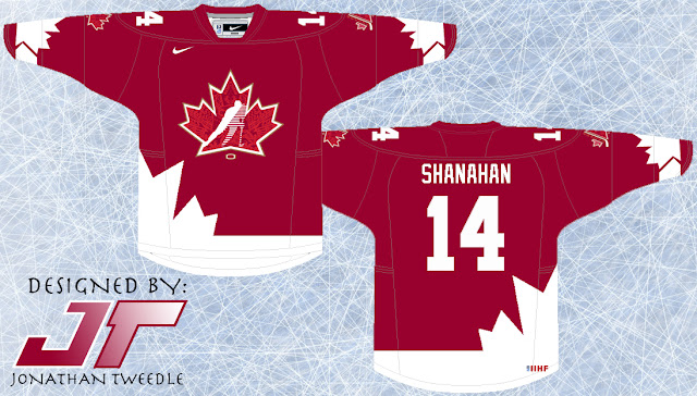
Finally, the Red alternate takes the Maple leaf look and gives it a classic, 70's feel to it.
In all 3 concepts I've created a variation of the Hockey Canada logo and blended it with the 2010 Vancouver logo, enjoy:
New Hockey Canada Logos:


