Friday, 15 March 2013

Rebrand Series: San Jose Sharks

With a nickname like the Sharks, San Jose has HUGE potential to do something unconventional and pretty awesome with their logo and jerseys.  And from 1998-2007 the Sharks definitely had unconventional jerseys.  The image of Owen Nolan on the cover of EA Sports NHL 2001 in that Sharks jersey will forever be etched in my mind and it served as inspiration for this concept.
As a result of the Reebok edge era of the NHL the Sharks experienced a complete overhaul for the logo and jerseys.  The current Sharks logo looks amazing with the modernized, more intimidating shark, but I'd have to say the jerseys are lacklustre.  This was the main motivation behind the direction I went with the jersey design for my rebranded Sharks jerseys.
What I've done is taken the pre-edge-era Sharks jersey and given it a modern-day update.  The most notable focal point of the jersey is the black striping engulfing the sides and chest of the jersey, intended to look like a shark fin.  Different from it's pre-edge-era counterpart I've added an element to this section of the design, using a similar, white shark fin shape outlined in orange, the reason being it adds volume and depth to the jersey, instead of being bland.  I've also removed the grey section seen on the actual jersey because it just doesn't work for me, and updated the sleeve design to  compliment the colour scheme on the mid section of the jersey.
The logo is an attempt to follow in the footsteps of the Tampa Bay Lightning by simplifying the logo.  I've taken the shark fin used currently as a shoulder mark on the Sharks jerseys and "encircled" it with the jaws of a shark.  Although I love the Sharks actual logo I had a lot of fun designing something new for the Sharks and think it blends well with the  jersey design itself.

New Sharks Logo:


New San Jose Sharks Home Jersey:


New San Jose Sharks Away Jersey:


Saturday, 9 March 2013

Rebrand Series: Penguins 3rds

The Penguins have had a couple of different 3rds in the past few years and one thing remains the same whenever the bring in a new one, bring back the blue.  Seeing the penguins in blue just seems weird to me, although I wasn't alive back when they actually wore blue, but something has always seemed off too me.
It may sound simple but having yellow in the Penguins logo on a blue jersey just seems tacky to me.  That's why when making a Penguins 3rd didn't necessarily think I needed to get rid of the blue jersey but instead change the logo to fit the jersey.
The jersey design is an old one that the Penguins used back in the 80s in blue and then switched to the black and yellow with the same design.  I brought it back with a few tweaks, most notably using different hues of blue both navy and sky.
The logo is the same as the one used in the Penguins rebranded home and away jerseys but I took out the yellow and used the 2 blues in a gradient pattern to make it a little less tacky.
I know it's a little out of the ordinary but what do you think?

New Pittsburgh Penguins 3rd Jersey:


Friday, 1 March 2013

Rebrand Series: Pittsburgh Penguins

For those of you who have dug deep into the archives of my jersey designs since I started this blog, you may have remembered that I designed a "new" Penguins logo.  At first you may not notice anything different than the one they currently use, however at a second glance you should notice two things: 1. that the Penguin is facing the opposite way as the real logo, and 2. that the Penguin is winding up for a slap shot as apposed to having his stick on the ice.
Well, I've taking that logo and tweaked it even more to add a little Tweedle flare to my Penguins rebrand concept.  I think I will dub it the best of both era's logo.  As you can see I've kept "my penguin" although I've flipped him to the original direction of the real logo.  Additionally, I've taken the 90s Penguin logo and placed him in the background with some slight modifications to make him look more modern.  At first I thought that perhaps it may be too busy, having 2 Penguins as the focal point, but the more I look at it, the more I am beginning to love this logo.
That is only half the battle, the second half is the jersey itself which is also a blending of era's.  I've taken the basic design of the jerseys that the Penguins used just prior to the Reebok edge era and mixed it in with the Penguins infamous late 90s gradient jersey.  Obviously, I've updated the colour palette and what has been created is what you see before you.

So....what do you think?

New Penguins Logo:


New Pittsburgh Penguins Home Jersey:


New Pittsburgh Penguins Away Jersey:


Saturday, 23 February 2013

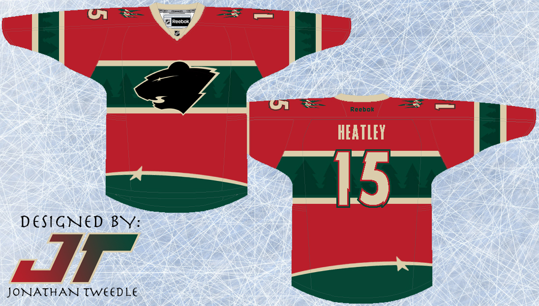
Rebrand Series: Wild 3rds

I guess you could say this type of concept is starting to become my trademark.  I don't know what it is about this type of design, but I think it looks awesome.  It looks, classic, slick, clean, but unique and modern as well.
I've taken the elements from the current wild logo and put them into the jersey design.  The trees accenting the green parts of the jersey and the Star that forms the eye of the logo at the bottom of the jersey to add just another element of uniqueness to this concept.  Finally, I've created a black version of the current Wild logo because, well, because it looks pretty sweet...hopefully.

New Minnesota Wild 3rd Jersey:


Thursday, 14 February 2013

Rebrand Series: Minnesota Wild

This concept is Wild, straight up! this logo is one of the first I created when I decided to rebrand the entire NHL.  I've been sitting on it for a while now, uncertain of how I should go about making a jersey fit for the logo.
I completely understand that both the logo and the concept are out in left field, but with a nickname like the WILD, why not attempt to give some real meaning behind the name with a logo and jersey set that match the name.
The logo is meant to strike fear into opponents, with 2 glaring eyes staring at you through the scratch marks, and the WILD text just so you don't forget who you're afraid of.
With a logo that is so primal, I had to design a jersey set that matched the logo's intensity.  Overall I wanted the jersey to look like it had just been attacked by the very beast I was trying to portray with the logo.  That being said, I didn't want it to look tacky and random, which I why I struggled with the jerseys for so long.  In the end, I tried to capture the essence of a classic hockey jersey but on the edge of crossing that line.  Finally, you will notice that the Wild away jersey is beige not white.  Simply put the Wild own that beige look, and the white just doesn't look right.

New Wild Logo:


New Minnesota Wild Home Jerseys:


New Minnesota Wild Away Jerseys:


Friday, 8 February 2013

Rebrand Series: Oilers 3rds

Originally, I was going to use this logo as the primary mark for my rebranded Oilers designs.  When my creative juices finally started flowing I replaced the spawn logo with a creation of my own, but I knew I had to bring it back in some capacity.  The Spawn logo is easily my favourite of all the Oilers logos and all I've done is change the colours to match the orange and navy colour scheme used for this new 3rd jersey I've designed.
The jersey design is nothing complex, but the simplicity is what makes it stand out for me.  I brought back the Oilers navy that they rocked before the throwbacks became their primary, but instead of going with the bronzy orange, I used the throwback orange with really makes the colours pop on the jersey.  Kind of a simple design, but I hope you guys like it.

Updated Spawn Logo:


New Edmonton Oilers 3rd Jerseys:


Saturday, 2 February 2013

Rebrand Series: Edmonton Oilers

When I was designing a jersey and logo for the Oilers I originally decided to just take the "Spawn" logo that the Oilers used on their 3rds prior to the Reebok edge era and change the colours to reflect the Oilers current palette.  Everything was all good, logo fit and I designed the jersey to pay tribute to 3 different styles the Oilers have worn in their past.
The striping on the jersey is inspired by the striping from the jerseys the Oilers wore just prior to the Reebok edge era.  In addition to the stripes I've taken an element from the Reebok edge jerseys in which the arm stripes only go up half way, giving the jersey a little more of a modern look.  Finally, and quite simply I've used the Oilers retro colour scheme because, to be honest, the colour scheme they used before was pretty dull.
I was ready to post the jerseys a while ago, but for some reason I hesitated because I felt like i was copping out by not actually designing my own logo.  So, last week I was finally hit with an idea, which has finally materialized into a logo I'm proud to post.  In the foreground is an oil drill, the element I was struggling with for the longest time, but I finally found on that fits into the look of the design.  I then layered the Oilers current text mark over top of the drill, and put the Edmonton skyline in the background.  Finally, the shape of the border was loosely inspired by the Oilers AHL affiliate the Oklahoma City Barons.

New Oilers logo:


New Edmonton Oilers Home Jersey:


New Edmonton Oilers Away Jersey: