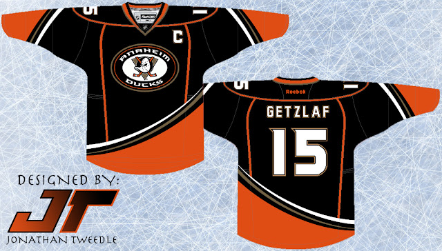
This is where I come in, I've taken that shoulder patch and made it the focal point of my Rebranded 3rd for the ducks. Going along side that I've tried to recreate a retro feel for the jersey, giving it similar, but different curvature and arm stripes as their original teal and maroon wonders. That being said I made the stripes come from the opposite side to make it more "up-to-date". I contemplated making the base colour for this jersey orange, but I thought it might be a little too much to handle on the eyes, who knows if I keep playing around with it I might find the perfect balance in order to make a sweet orange Ducks jersey, until then, enjoy:
Friday, 3 August 2012
Rebrand Series: Ducks 3rds
I've said this many times before and I'm going to say it again...The Ducks need to bring back the Wild Wing logo. They want to, you can tell, when the introduced their current 3rd jersey they put an updated version of the guy on their shoulder patch. Anaheim just fully commit to the Wild Wing, nobody likes your boring "ducks" text across the front anymore.
This is where I come in, I've taken that shoulder patch and made it the focal point of my Rebranded 3rd for the ducks. Going along side that I've tried to recreate a retro feel for the jersey, giving it similar, but different curvature and arm stripes as their original teal and maroon wonders. That being said I made the stripes come from the opposite side to make it more "up-to-date". I contemplated making the base colour for this jersey orange, but I thought it might be a little too much to handle on the eyes, who knows if I keep playing around with it I might find the perfect balance in order to make a sweet orange Ducks jersey, until then, enjoy:
This is where I come in, I've taken that shoulder patch and made it the focal point of my Rebranded 3rd for the ducks. Going along side that I've tried to recreate a retro feel for the jersey, giving it similar, but different curvature and arm stripes as their original teal and maroon wonders. That being said I made the stripes come from the opposite side to make it more "up-to-date". I contemplated making the base colour for this jersey orange, but I thought it might be a little too much to handle on the eyes, who knows if I keep playing around with it I might find the perfect balance in order to make a sweet orange Ducks jersey, until then, enjoy:

