It's been a while, too long. life has been crazy, in a good way but I'm back and ready to go!
I'm jumping back into things with the Bruins 3rds I designed to go with the rebranded jerseys. The design for the 3rds was inspired by the Ottawa Senators 3rds that were introduced this past year. The barber pole stripes are a classic look, the Boston Bruins are a classic, original 6 team so where could anyone go wrong by combining the 2. I know the brown is a bit of a stretch but back in the day the bruins rocked the bruin and I feel it gives it a little bit more of an authentic feel to the jersey.
The logo, I've used before with my first Bruins concept, it works, simple enough but also pays tribute to what the team is actually named after in the first place. What do you think?
Thursday, 30 August 2012
Monday, 6 August 2012
Rebrand Series: Boston Bruins
Not too much to say about the new Bruins concept, although it has many similarities to their actual 3rds (which are SWEET) this one is also quite a bit different.
I tried making the whites without the the black sleeves but it looked tacky, so I'm liking the executive decision to add the black sleeves.
The jersey itself has, much like my first bruins concept, a bear paw/claw mark like striping on the jersey.
The logo, is a mashup of their current 3rd jersey logo, their primary logo and a Bear paw, and I'm loving the way it turned out.
New Bruins Logo:
New Boston Bruins Home Jerseys:
New Boston Bruins Away Jerseys:
Friday, 3 August 2012
Rebrand Series: Ducks 3rds
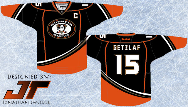
I've said this many times before and I'm going to say it again...The Ducks need to bring back the Wild Wing logo. They want to, you can tell, when the introduced their current 3rd jersey they put an updated version of the guy on their shoulder patch. Anaheim just fully commit to the Wild Wing, nobody likes your boring "ducks" text across the front anymore.
This is where I come in, I've taken that shoulder patch and made it the focal point of my Rebranded 3rd for the ducks. Going along side that I've tried to recreate a retro feel for the jersey, giving it similar, but different curvature and arm stripes as their original teal and maroon wonders. That being said I made the stripes come from the opposite side to make it more "up-to-date". I contemplated making the base colour for this jersey orange, but I thought it might be a little too much to handle on the eyes, who knows if I keep playing around with it I might find the perfect balance in order to make a sweet orange Ducks jersey, until then, enjoy:
This is where I come in, I've taken that shoulder patch and made it the focal point of my Rebranded 3rd for the ducks. Going along side that I've tried to recreate a retro feel for the jersey, giving it similar, but different curvature and arm stripes as their original teal and maroon wonders. That being said I made the stripes come from the opposite side to make it more "up-to-date". I contemplated making the base colour for this jersey orange, but I thought it might be a little too much to handle on the eyes, who knows if I keep playing around with it I might find the perfect balance in order to make a sweet orange Ducks jersey, until then, enjoy:
Subscribe to:
Comments (Atom)


