Thursday, 25 October 2012

Rebrand Series: Dallas Stars

Let's be honest, one of the most defining features for the Dallas stars has been green.  But ever since the Reebok edge jerseys took over, there is barely any green in the Stars uniforms, and beyond the stars and the Wild there is no other green in the NHL, a travesty indeed.
With that being said, I'm bringing the green back to Texas.  Seeing as they are the Dallas Stars I decided to incorporate that into the striping of the jersey, while I had doubts at first, I think it works out pretty well.
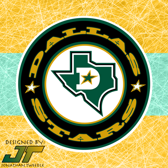
With the logo, I added a D, with a star in the middle of it on top of the Texas state logo the Stars have used in the past, and encircled it to give it a classic hockey look.

New Stars Logo:


New Dallas Stars Home Jerseys


New Dallas Stars Away Jerseys


Saturday, 20 October 2012

Rebrand Series: Sabres 3rds

Now that I've quickly come to my senses (with the help of my buddy Rodney) I've realized that giving the Sabres a black and yellow jersey is just a bad idea.  Especially considering the fact that the Sabres divisional rival the Bruins have rocked that colour scheme since the beginning of time.  I've made some quick revisions and am ready to unveil my rebranded Sabres 3rds.  I've kept the black concept in here just for kicks, man what was I thinking?!

New Sabres Alternate logo


New Sabres 3rd Jersey


Sabres Black Concept
(What was I thinking?)


Sunday, 7 October 2012

Rebrand Series: Buffalo Sabres

I can't remember if I had already posted this set of jerseys yet, it's been a while so I guess I'll just treat it like I haven't.  Simply put I've decided to take the Sabres jerseys from the mid 90's and updated the colour scheme as well as modernized the look a little bit.  Obviously I'm a fan of pretty much every jersey I make but I got to say that I really like how these ones turned out.
The logo is also an updated version of a classic.  I've combined the double sabres logo that was used on the Sabres 3rds, back in the mid 90s and taken the Buffalo head that was the primary logo for the Sabres for a number of years and made a "tribute" to the original Sabres logo, which is their current logo again anyways.

New Sabres Logo


New Buffalo Sabres Home Jerseys


New Buffalo Sabres Away Jerseys


Sunday, 30 September 2012

Rebrand Series: Winnipeg Jets 2.0

So this is a slight break from the mould but, I'm revisiting my rebranded Winnipeg Jets jerseys.  I don't know how many of you know this but the jerseys were FINALLY featured on the icethetics website on August 10th (the day I got married so sorry for the lack of keeping you in the loop).
I got some pretty good feedback about the jersey, overall, most people really liked it, but a suggestion that kept popping up was that the red maple leaf took bled into the Jets text and looked to busy.  with those suggestions in mind I took another look at my logo and jersey set.
I decided that perhaps a more nuetral background colour would not look as busy or distracting so here it is.  My Jets 2.0 logo and jersey set.....WHAT DO YOU THINK?!

Jets 2.0 Logo


Winnipeg Jets 2.0 Home Jerseys


Winnipeg Jets 2.0 Away Jerseys


Friday, 21 September 2012

Rebrand Series: Avalanche 3rds

To keep it short and simple the avs have tried and failed to represent a jersey where the primary colour is blue.  Here is my attempt in correcting that path; as you can see I've brought back the "mountain" effect for the sleeves of the jersey but left it off the bottom, instead I gave it a more modern, rounded feel to balance the jersey out.  I've also combined the Avalanche's primary logo with their shoulder patch to create this "new" logo.

3rd Jersey Logo:


New Avalanche 3rds:


Thursday, 13 September 2012

Rebrand Series: Colorado Avalanche

It's been a while since I've posted anything, life has been crazy lately.  I'm hoping this post will make up for the lack of jersey love on my behalf.
The Colorado Avalanche haven't really changed their branding since they entered the league, their logo has stayed virtually the same with a few colour tweaks and a similar jersey style even with the introduction of the Reebok edge jerseys.  One thing the Avs are infamous for ugly third jerseys!!!
While my new jersey designs aren't drastically different, they are different enough. I've kept the blue sleeves to contrast the maroon and I think it blends quite well.  The bottom striping is my attempt at making it look like an avalanche sweeping across, hoping it doesn't look tacky.
Finally, and what I've worked the hardest on for this jersey set is the new logo.  Simply put, I've mashed the Avalanche's current logo with their former identity the Rockies logo.  Adding the most recognizable components of each gives the logo a classic modern, authentic contemporary feel, if that makes any sense at all.  I've replaced the C that quarterbacks the Rockies logo with the C that Joe Sakic wore on his chest for oh so long.
Although it's been a while I hope this concept makes up for lost time:

New Avalanche Logo:


Colorado Avalanche Home Jersey:


Colorado Avalanche Away Jersey:


Thursday, 30 August 2012

Rebrand Series: Bruins 3rds

It's been a while, too long.  life has been crazy, in a good way but I'm back and ready to go!

I'm jumping back into things with the Bruins 3rds I designed to go with the rebranded jerseys.  The design for the 3rds was inspired by the Ottawa Senators 3rds that were introduced this past year.  The barber pole stripes are a classic look, the Boston Bruins are a classic, original 6 team so where could anyone go wrong by combining the 2.  I know the brown is a bit of a stretch but back in the day the bruins rocked the bruin and I feel it gives it a little bit more of an authentic feel to the jersey.
The logo, I've used before with my first Bruins concept, it works, simple enough but also pays tribute to what the team is actually named after in the first place. What do you think?