Friday, 21 December 2012

Rebrand Series: Chicago Blackhawks

The Blackhawks have a very rich history, that being said I gotta say their logos could use a bit of an update.  I know many of you will disagree as time and again the Blackhawks logo is rated as one of the best, but I gotta say I'm not a huge fan.
With that it mind, the 3rd jersey that the Blackhawks just recently retired is one of my favourites of all time.  As a result I've decided to take that jersey design as the basis of this rebrand and spruce it up with some flare and a new logo.
The jersey itself is indeed very similar to the actual 3rds the Blackhawks were wearing a couple of years ago, but I've taken the liberty to add some new elements. I've added faint tomahawks and feathers within the beige portions (black portions on the away jersey) which, as seen on my rebranded Red Wings jerseys, looks pretty sweet!
The logo itself is a tribute to the logo dawned on the jersey my concept is based on, with the Blackhawks text encircling a new logo.  Inside I've placed a 3 feathered headdress sitting behind a pair of tomahawks which I think pays tribute to the teams nickname without being slightly offensive, hopefully.
I experimented making the away version beige, but it just looked tacky so I stuck with the white, enjoy:

New Blackhawks logo:


New Chicago Blackhawks Home Jersey:


New Chicago Blackhawks Away Jersey:


Saturday, 8 December 2012

Rebrand Series: Kings 3rds

I know its been too long since my last post, I've had a hard time coming up a concept I liked for the Kings 3rds.  I went through a handful of different ideas on the jersey design itself, finally I landed on this one.
The inspiration behind the entire jersey was from all of the Los Angeles major sports teams.  first off the logo is a combination of the LA Dodgers logo and the crown from the kings.  Then, instead of using the dull purple the Kings used prior to their new threads, I've used the LA Lakers purple in junction with the classic black and silver the Kings wear so proudly.
The design, in a small way was also inspired by the Dodgers and Lakers as well.  Both teams have specific jersey sets that have a a solid line under the arm straight down to the bottom of the jersey.  I couldn't leave it plain so I also added a couple of stripes on the arms to even it out.

New Kings Alternate Logo:


New Los Angeles Kings 3rd Jersey:


Friday, 23 November 2012

Rebrand Series: Los Angeles Kings

Well, you might have thought that after posting a winter classic concept for the the Wings naturally, I'd turn to their counterpart and post a Maple Leafs concept....but they aren't ready yet.

Instead, The Los Angeles Kings have been in the limelight since their EPIC stanley cup run and I hope I can do them justice with this new set of jerseys.
I know they are very unconventional and very unique but I'm hoping they grow on you as much they have on me.  They rational behind the jerseys goes back to the logo the Kings wore in the Wayne Gretzky era.  If you look closely at the logo you will see that the KINGS text has those "movement" lines streaking from them, so I incorporated those lines into the jerseys.  I also took the silhouette of that logo and used it as a source for these streaking lines.  Finally, I spent many hours contemplating between vertical or horizontal lines on the sleeves but when it was all said and done I thought it looks best with one of each.
The logo is simply a updated colour palette of the primary logo the Kings used from 1967-1988.  I promise I'm working on a logo of my own for their 3rds, should be good.
Again, very out of the ordinary, and very unconventional but I hope you like it:

New Kings Logo:


New Los Angeles Kings Home Jerseys:


New Los Angeles Kings Away Jerseys:


Saturday, 17 November 2012

Rebrand Series: Red Wings 3rds

Well this would have been perfect had the NHL lockout not happened and the winter classic canceled.  When the Red Wings announced they'd be hosting the winter classic I knew I had to make a concept for the occasion, I didn't know it would take this long and be irrelevant when I posted it.
From my understanding, the jerseys the Wings were going to wear for the 2013 winter classic a retro jersey the Wings wore in 1992.  What I've done is take that design and switch the white and red to make it a "home" version of the retro look.  I've also caved and went with recent trends by using the beige instead of the white to give the jersey a more rustic, authentic look.
The logo also needed to look classic, so I encircled my updated logo and jazzed up the circle but putting DETROIT RED WINGS around it and added the D from the cougars jerseys they wore in the winter classic against the Blackhawks and I believe I achieved a very classic look with it.

Red Wings Winter Classic Logo:


New Detroit Red Wings Winter Classic Jerseys:


Friday, 9 November 2012

Rebrand Series: Detroit Red Wings

Seeing as the Red Wings are my favourite team one would think this would be one of the first concepts I would have posted for the rebrand series.  Here's the thing, I really struggled to come up with something that suited the Wings.  The Red Wings are one of a few teams who have changed the uniforms very little over the years and I didn't want to mess with the classic look that the Wings own so well.
First off, you'll notice I've used the logo I created for my very first Red Wings concept, simply because it's awesome (obviously bias opinion, but come on, how sweet does it look am I right?).
I decided to use their Winter classic jersey from a few years back as the basis and build on it.  As you can see I've added a new colour to the uniforms, a very subtle silver, to accent the lines and help them pop out just a little bit more.  I've also decided to use a darker red on the uniforms because, to me it looks crazy good!  Finally I've laced the jersey with a faded graphic of the wing in the space between the silver stripes which I believe adds an element of uniqueness to the jerseys but not in a distracting way, or a way that takes away from the classic look of this jersey.
You might also notice that I've put a C on both sets of jerseys although the Wings haven't named a new captain yet.  That being said, Zetterberg or Datsyuk are obvious choices for the job and either one of these guys would be a great captain, the C looks great on either of these jerseys.
I'd like to think this jersey could be considered a retro modern look...if that makes any sense.

New Red Wings Logo


New Detroit Red Wings Home Jerseys


New Detroit Red Wings Away Jerseys


Friday, 2 November 2012

Rebrand Series: Stars 3rds

I've given the Stars back their green and when designing their new 3rd jersey I decided that I'd let them rep the black again. The design is a sort of hybrid if you will; inspired by the Stars current home jersey and the Star original black jersey when the first moved to Dallas from Minnesota.
The logo, is yet another page taken out of the Tampa Bay Lightning redesigning effort, simplicity is best.  With that in mind I took the Dallas Star and used a D as its backdrop.

New Stars Alternate Logo:


New Dallas Stars 3rd Jersey:


Thursday, 25 October 2012

Rebrand Series: Dallas Stars

Let's be honest, one of the most defining features for the Dallas stars has been green.  But ever since the Reebok edge jerseys took over, there is barely any green in the Stars uniforms, and beyond the stars and the Wild there is no other green in the NHL, a travesty indeed.
With that being said, I'm bringing the green back to Texas.  Seeing as they are the Dallas Stars I decided to incorporate that into the striping of the jersey, while I had doubts at first, I think it works out pretty well.
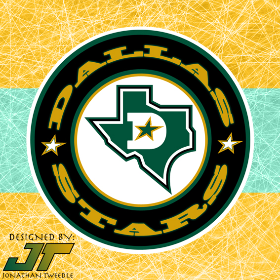
With the logo, I added a D, with a star in the middle of it on top of the Texas state logo the Stars have used in the past, and encircled it to give it a classic hockey look.

New Stars Logo:


New Dallas Stars Home Jerseys


New Dallas Stars Away Jerseys