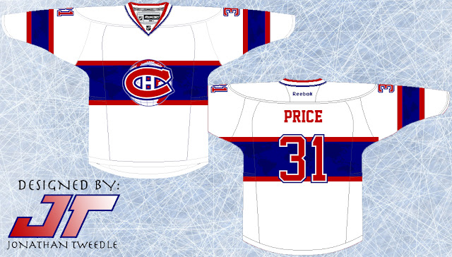
With that said let's talk about the logo: Simply put, I've taken the current Habs logo and slapped it on top of a version of the globe logo they used way back in the 1920s. I've tried to take two eras of the most historic team and blend them together to create a unique new look.
The jerseys are a version of what the Canadiens use now. The Home jersey is pretty much the same except you may notice that I've taken the two thin stripes off the bottom of the jersey. That's not all, I've also put a faint deep blue print of the world map inspired by the 1920s globe logo. The away version is the exact opposite of its home counterpart which IS a big step away from the norm for them, but sometimes we should embrace change.
New Canadiens Logo:
New Montréal Canadiens Home Jersey:
New Montréal Canadiens Away Jersey:


