Showing posts with label Southeast. Show all posts

Sunday, 29 September 2013

Rebrand Series: Lightning 3rds

Before the Lightning rebranded a couple of years ago and switched to Blue as their primary colour they've been without a Black jersey.  Frankly, I loved the black jerseys they wore before the rebrand and I knew I'd have to bring black back when I rebranded the team.
With that in mind here is what I've done; I've taken the Bolts current 3rd jersey and reversed the colour scheme.  I'd like the believe that this change works pretty well and the result is a pretty sweet jersey:

New Tampa Bay Lightning 3rd jersey:


Monday, 16 September 2013

Rebrand Series: Tampa Bay Lightning

I've said it before but the Lightning have so much potential for an out of the box jersey design with a name like the Lightning.  In fact, I've posted one I designed way back when.  This time around I've improved upon my design and made a New home and away version of my original design.
I know it's not a brand new logo or completely new design but I love how it turned out, and I promise I have some new Lightning logos in the works.
In the meantime, enjoy a new rendition of an old favorite of mine:

New Lightning Logo:


New Tampa Bay Lightning Home Jersey:


New Tampa Bay Lightning Away Jersey:


Sunday, 8 September 2013

Rebrand Series: Capitals 3rds

I know you've seen this jersey before but I can explain.  I've always liked the idea of the Caps having a Blue version of their current home/away jersey set, but I've done that already so, I went with a new version of my rebranded Flyers jersey.  It has a certain familiarity about it, being very comparable to the Caps actual design but also an element of simplification.
The Logo, just kind of came out of know where, I was looking at some sort of soccer logo and then all of a sudden got an idea that turned into this.  I can't really give you any rhyme or reason as to why it turned out this way but hey, it looks pretty decent:

New Capitals Alternate Logo:


New Washington Capitals 3rd Jersey:


Monday, 2 September 2013

Rebrand Series: Washington Capitals

The Capitals logo is cool, but I just think there is so much untapped potential with the eagle logo they have in their arsenal that isn't really being used.  As a result I have made it my mission to incorporate the eagle into almost every Capitals logo I've made.  My newest rendition includes the US Capitol (did you guys even know the bottom of the eagle is in the shape of the Capitol, MIND BLOWN) and of course I had to ad some stars and stripes to make it a little more American.
The jersey design itself comes from an All-Star jersey back from 1991-92.  Personally, I wouldn't have ever even known about these jerseys unless my boy Drake didn't represent one of them at the NHL All-Star game a few years ago in Ottawa.  When I was reminded of this jersey I knew I'd have to use them for one of my designs.  I've added another stripe to the bottom of the jersey to jazz it up a bit but other than that, this design need not any improvement.

New Capitals Logo:


New Washington Capitals Home Jersey:


New Washington Capitals Away Jersey:


Saturday, 20 April 2013

Rebrand Series: Panthers 3rds

Not much to say about this one other than it is a colour variation of the Rebranded Panthers jerseys I posted last week.  Although the Panthers went back to red this past season (which was an excellent choice) they can still rock the blue...assuming there is no powder blue to go with it.
In terms of the logo, I've used the same logo I created for the Home and Away jerseys but took the text out to switch things up.  Although the changes aren't drastic I think overall these 3 jerseys give the Panthers a fresh new look and give them an edge in the intimidation factor.

New Florida Panthers 3rd Jersey:


Saturday, 13 April 2013

Rebrand Series: Florida Panthers

Way back when I started this rebrand project one for the first logos I came up with was this one for the Florida Panthers, I knew I wanted to create something that would strike fear into the hearts and minds of their opponents and I knew I'd be stepping out of the box of conventionality on this one.  The problem was for a very, very long time I could come up with a jersey to match my vision, everything seemed to just fall short.
A few weeks ago I took another crack at the jersey design and then it dawned on me; use the current jersey design to inspire a new, more intimidating look for the Panthers. With that in mind, I took all the stripes and jersey elements from the Panthers current home and away jerseys and turned them into a playground of scratch makes.  Although unconventional, who says every team has to have a jersey that fits into a cookie cutter design and completely turn their backs on the uniqueness that each team and team culture that they have when creating a new identity.

New Panthers Logo:


New Florida Panthers Home Jersey:


New Florida Panthers Away Jersey:


Sunday, 30 September 2012

Rebrand Series: Winnipeg Jets 2.0

So this is a slight break from the mould but, I'm revisiting my rebranded Winnipeg Jets jerseys.  I don't know how many of you know this but the jerseys were FINALLY featured on the icethetics website on August 10th (the day I got married so sorry for the lack of keeping you in the loop).
I got some pretty good feedback about the jersey, overall, most people really liked it, but a suggestion that kept popping up was that the red maple leaf took bled into the Jets text and looked to busy.  with those suggestions in mind I took another look at my logo and jersey set.
I decided that perhaps a more nuetral background colour would not look as busy or distracting so here it is.  My Jets 2.0 logo and jersey set.....WHAT DO YOU THINK?!

Jets 2.0 Logo


Winnipeg Jets 2.0 Home Jerseys


Winnipeg Jets 2.0 Away Jerseys


Thursday, 26 July 2012

Rebrand Series: Hurricanes 3rds

While at a quick glance you may think you've seen this jersey before, a second glance will prove your initial retain wrong.  Yes the colour scheme, letters diagonally across the jersey are exactly the same the design has been updated.  To make this jersey a little but more unique, besides the fact that no one uses grey as a base colour for a jersey, I've turned the design used for the rebranded canes jerseys on its head.  rotating and distorting the alignment of the stripes gives the jersey a "chaotic" feel, one in which I can only imagine you must feel if caught in an actual hurricane, after all we've gotta give meaning to this team's nickname.
Finally, although not the primary focus of this jersey, I've created a new shoulder patch which can be found also on the original rebranded canes jersey posted earlier in the week.  This logo includes the new flag design standing beside a map of North Carolina both on top of a faded current Hurricanes logo, encircled by Carolina Hurricanes which gives the logo a vintage but modern feel.

New Hurricanes Shoulder Patch:


New Hurricanes 3rd Jersey:


Monday, 23 July 2012

Rebrand Series: Carolina Hurricanes

While I posted a couple of new Hurricanes jerseys a few weeks ago I did the same as I did with the flames jerseys, rethought the design and created a brand new Canes identity.  Very much like the Flames design I have created a lightning inspired logo for the Hurricanes to rock.
If you have a keen eye for detail you will notice that the flag is very similar to the flag used on the Hurricanes current 3rd jersey but different enough to make it unique.  more importantly, the circle engulfing the flag is actually the outer portion of the Hurricanes current primary logo.  Not to pat myself on the back or anything but I love this logo!
The jersey design itself was inspired by the Hurricanes current word mark. , if you look closely the effect behind the text looks very similar to the stripes on the across the jersey, just another little detail I pay close attention to, to make every jersey I design as unique as possible.
Although The canes have always used Red as their primary colour I think the red accent really makes the design pop out more effectively.

New Hurricanes Logo:


Carolina Hurricanes Home Jersey:


Carolina Hurricanes Away Jersey:


Friday, 13 July 2012

Rebrand Series: Jets 3rds

Although the Thrashers couldn't really pull off the powder blue, I think the Jets might just have what it takes to do what their former team could not.
Why not pay tribute to the club that gave new life to the Jets franchise.  Thank you Atlanta for not only bringing the Jets back but giving new life to an awkward coloured Thrashers jersey that fits perfectly with the Jets new colour scheme.


Monday, 9 July 2012

Rebrand Series: Winnipeg Jets


As I have mentioned the last time I posted a Jets concept, since the news that Winnipeg was going to have an NHL franchise back I have been a Jets super fan! With The Red Wings as my favourite team and the Lightning my 2nd, the Jets are My Canadian team, and although many critics have blasted the jets logo and jerseys I absolutely love them.
With all that in mind, it is only appropriate that with my very first blog post being a Red Wings concept, the first of my NEW DESIGNS should be a Jets concept, so here it is.
 First off, the NEW Jets logo.  I've combined the Jets current logo with their 90's logo and modernized the colours to complete the look.  You will notice that I've replaced the 90's jet nose with the current jet used in the Jets real logo, I've also added 'jet streams' to the jet to make the text come alive and give some flare and character.
 The jersey itself I tried to capture the jet stream look I've also incorporated into the logo and combined the iconic jet and maple leaf of the new Jets logo onto the jersey design itself.  Both the home and away versions of this jersey have a close resemblance to the jerseys the Jets currently wear...but look SOOO much more awesome!


Friday, I will be posting my rebranded 3rd jerseys for the jets that will pay tribute to a jersey used by the Jet's former home, the Atlanta Thrashers.
 P.S:  A website I follow closely called Icethetics, and within minutes I got a response that he would be posting this design on his site in the near future.
If you guys haven't check out Icethetics, DO IT!! It was the inspiration behind me starting to design again and to start this blog, while my blog is just my concepts and I only post new concepts weekly, Icethetics posts new concepts from various artists DAILY.  And it is such a HUGE milestone for me to be featured on the site when my Jets design is posted on it.
 I don't know when it will be posted on Icethetics, but as soon as it goes up, I will let you know for sure,
but I wanted to give you guys the first look at it before the whole world sees it (I wish lol)


New Jets Logo:


Winnipeg Jets Home Jerseys:


Winnipeg Jets Away Jerseys:


Friday, 4 May 2012

Letters to the President: Washington Capitals

Did you guys know that the bottom of the Eagle logo the caps use is shaped like the top of the white house?!?!?!?!?!?!?! I didn't until like a month ago and when I figured it out my jaw dropped.  My brain also started racing thinking how I could make a new logo with that in mind. That new logo will drop in a new rebranding series I'll be starting shortly, until then I've made their current eagle a little more patriotic, after all it is the Nations Capital.
In terms of the jersey I've tried to make it as, US capital-ish as possible and I think it works.

This is my last 2003/04 concept which means that from here on out we are journeying through unchartered territory:


Original Concept From 2004:


Friday, 20 April 2012

Flashes of Genius...Flashes of Lightning

I take pride in the designs I make, and I'd like to think that I do a pretty good job too.  And I've got to say, this new Tampa Bay lighting jersey is one of the best I've done and there is ALOT going on in it.  First off, and most obviously the lightning bolts on the sleeves are freaking AWESOME!!!!! my original drawing from 2003 looked pretty bland so I decided to bring it to life, and I think it worked.  You'll also notice the lightning stripe on the bottom of the jersey which completes the look for sure.
Finally, and this one is a bit more subtle, if you look closely, you'll notice I've created a new logo for the lightning.  I've combined many different elements of past lightning logos to create this, what I think, i a pretty sick logo....3rd jersey's anyone?


Closer Look at the New Logo:


Original Concept From 2003:


Monday, 13 February 2012

Using my Bulimic powers (Yes I Can Read Minds): Carolina Hurricanes

I AM A GENIUS!!!!!!

You may not believe me but I came up with the Canes 3rd jerseys before they did.  Don't believe me well I have the drawing with the date and my signature on it to prove it!

Although you will notice that it is, slightly to significantly different.  But still, I had the idea before the Canes started using them.  The logo, I was spot on!  the colour of the jersey, also spot on, the cool looking "hurricane" squares at the bottom of the jersey, close, just didn't get the colours rights.

So come on, how about a round of applause for my ability to inspire a real NHL jersey design, even if they didn't realize I was inspiring them?!

NOTE: THE HURRICANES DIDN'T START USING THEIR CURRENT 3RD JERSEYS UNTIL 2008, I DESIGNED THIS JERSEY IN 2003.....JUST SAYIN


Original Concept From 2003


Friday, 3 February 2012

Return of the Winnipeg Jets

After posting the Thrashers Jerseys on Monday I just had to make a Jets jersey to follow it up.  When I heard that the Thrashers were moving to Winnipeg I was perhaps one of the most excited people in the world, I was like a kid in the candy store!  I literally checked every single day for any updates on what they'd be called and then what their jerseys would look like, let's just say it was a long summer.
You guys may have seen a version before, originally it was the Ottawa RCAF Flyers jerseys back when they won the gold medal in 1948.  The manitoba moose wore the RCAF jerseys a few years back and after all the hype about the jets logo paying tribute to the Canadian Air Force I just had to make these jerseys.  Yes, the new jets logo looks very similar to the Canadian Air Force insignia, so I decided to pay the ultimate tribute to the Canadian Air Force by putting the jets logo on the RCAF flyers jerseys.  I've also added the modern shoulder logo to give it a little more jets flavour.  Don't worry the next Jets jersey I make will be much more creative.  Hope you guys like this one though.


Monday, 30 January 2012

RIP: Atlanta Thrashers

I'm hoping the wounds have healed for anyone who was or is a Thrashers fan, wait who am I kidding I'm a Canadian and everyone I know was super stoked that the Jets came back to Winnipeg, but thats a different post all together.

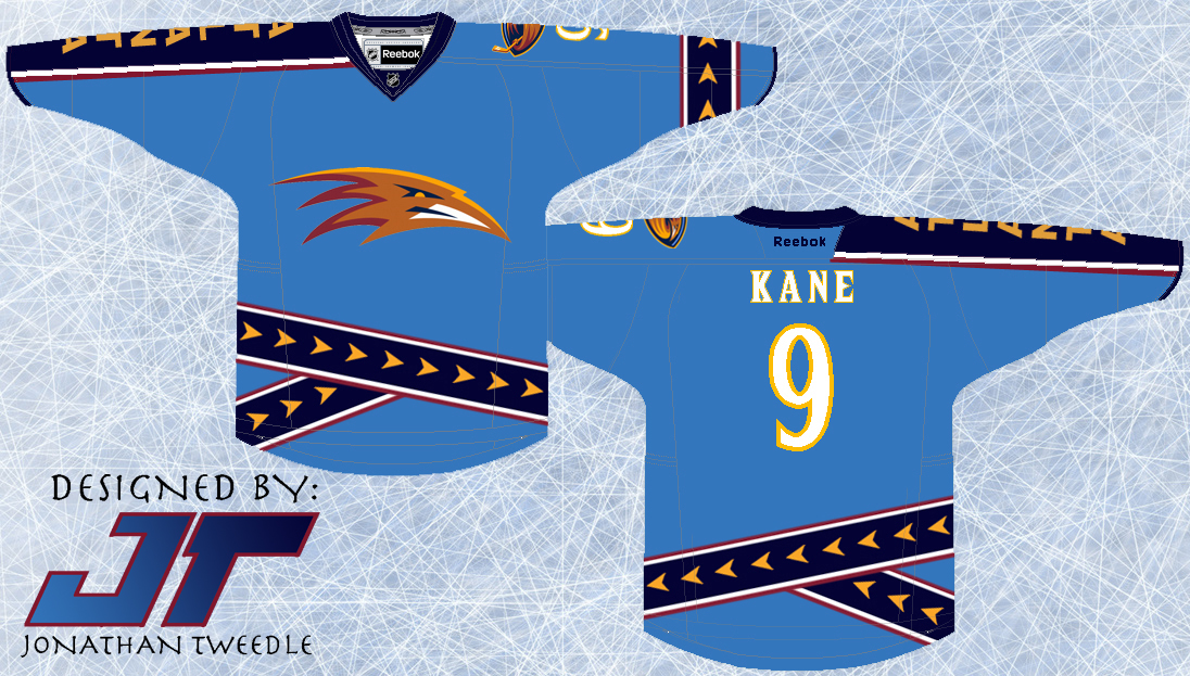
Back in 2004 when I designed this jersey the Thrashers still existed so it was relevant at some point.  As you can see the design is very similar to the 3rds the thrashers used back in 2003 and then turned them into their primary jerseys shortly after that.  BUT, it is different, first off the text spelling "ATLANTA" is on the opposite are, 2nd the logo in the middle is different.  Also the striping with the arrows is much different on the bottom as I've tried to bring it to life by angling and layering the pattern, as well I've added the arrow striping onto the other arm.  Although it is still very similar to the actual jersey I still really like it and tried as best I could to make it different enough.


A Shout out goes to my buddy Jeff who was my partner in crime when I started making these jersey concepts back in 2003.  He sent me an email a few weeks back and turns out we had actually made the Thrashers jersey Orange, so here's how it was supposed to look....BLUE LOOKS BETTER!


Original Concept from 2004:


Friday, 27 January 2012

Striking Intimidation into the eyes of their opponents: Panthers

This jersey design is quite simple, I wanted to make the florida panthers look more like a team to recon with instead of being seen as just another failed attempt to bring hockey to the deep south.  Simply put I made the striping for the jersey look like claw marks, a simple change but I think it proves its point.  Hope you guys enjoy!


Original Concept 2003:


Wednesday, 11 January 2012

Capitals 3rd Jersey


Ever since the capitals switched to their new style of jersey when the reebok edge jerseys came out, I've been a huge fan of them.  Other than the winter classic jerseys they use occasionally the caps don't really have a 3rd jersey anymore.  Year after year I've been waiting in anticipation for the caps to unveil their 3rd jerseys with the eagle on their shoulders as the new primary logo.  It hasn't happened yet, so I took matters into my own hands and decided to design it for them.