Showing posts with label Retro. Show all posts

Friday, 23 November 2012

Rebrand Series: Los Angeles Kings

Well, you might have thought that after posting a winter classic concept for the the Wings naturally, I'd turn to their counterpart and post a Maple Leafs concept....but they aren't ready yet.

Instead, The Los Angeles Kings have been in the limelight since their EPIC stanley cup run and I hope I can do them justice with this new set of jerseys.
I know they are very unconventional and very unique but I'm hoping they grow on you as much they have on me.  They rational behind the jerseys goes back to the logo the Kings wore in the Wayne Gretzky era.  If you look closely at the logo you will see that the KINGS text has those "movement" lines streaking from them, so I incorporated those lines into the jerseys.  I also took the silhouette of that logo and used it as a source for these streaking lines.  Finally, I spent many hours contemplating between vertical or horizontal lines on the sleeves but when it was all said and done I thought it looks best with one of each.
The logo is simply a updated colour palette of the primary logo the Kings used from 1967-1988.  I promise I'm working on a logo of my own for their 3rds, should be good.
Again, very out of the ordinary, and very unconventional but I hope you like it:

New Kings Logo:


New Los Angeles Kings Home Jerseys:


New Los Angeles Kings Away Jerseys:


Friday, 24 February 2012

Putting the Star Back in the Lone Star State: Dallas Stars

When I first made this concept back in 2003 it was a pretty simple, not really unique idea.  Reverse the colours from the Stars home jersey and use the Texas shoulder patch as the primary logo, pretty simple and straight forward.
But today it is a little more original then when I first made it 9 years ago.  Since the Reebok Edge jerseys came out a while back Dallas completely changed their look.  From having a very specific look with the Star jersey they switch to a very plain "modern look" and aren't even really using their logo very much either, they've replaced it with "DALLAS" along the front in very simple text.
So, here it is, bringing back the old school with a little swappage of the colours, enjoy;


Original Concept From 2003;


Friday, 10 February 2012

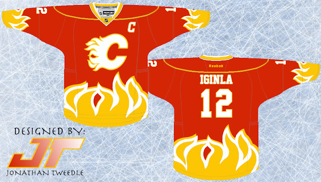
Adding Some Heat to the Flames


Today is your lucky day, because included in this post is actually 3 jersey design and the original concept.  The reason....I'm very indecisive.  The jersey concept itself is pretty straightforward; I added flames to the flames jersey instead of just having different kinds of striping.  REMEMBER, I made this concept back in 2003 and am in no way saying that these jerseys are the best I've ever created.  I'm still out on whether or not I like the design hence the fact that I made 3 different versions of it.  I think this design could work but not exactly which color scheme suits it best.  Let me know what you guys think; do you like the design? Which color scheme works best with the flames?

Flames Current Color Scheme


Flames Retro Color Scheme


Flames 2003 Color Scheme


Original Concept from 2003;


Wednesday, 8 February 2012

Yet another Jersey and Identity Crisis for Buffalo

Back in the day, when I originally drew this picture the sabres were using their red black and white jerseys.  Since then they've changed the colours, jerseys, and logos numerous times so needless to say this jersey was outdated shortly after I drew it.  I can't really remember why I chose to make the jersey look the way it does but I must say it still looks pretty cool, although I will admit that I'm glad they're back in blue and yellow.  So I guess the next time I make a new sabres jersey I will refresh it with some blue and yellow.


Original Concept from 2003;


Friday, 3 February 2012

Return of the Winnipeg Jets

After posting the Thrashers Jerseys on Monday I just had to make a Jets jersey to follow it up.  When I heard that the Thrashers were moving to Winnipeg I was perhaps one of the most excited people in the world, I was like a kid in the candy store!  I literally checked every single day for any updates on what they'd be called and then what their jerseys would look like, let's just say it was a long summer.
You guys may have seen a version before, originally it was the Ottawa RCAF Flyers jerseys back when they won the gold medal in 1948.  The manitoba moose wore the RCAF jerseys a few years back and after all the hype about the jets logo paying tribute to the Canadian Air Force I just had to make these jerseys.  Yes, the new jets logo looks very similar to the Canadian Air Force insignia, so I decided to pay the ultimate tribute to the Canadian Air Force by putting the jets logo on the RCAF flyers jerseys.  I've also added the modern shoulder logo to give it a little more jets flavour.  Don't worry the next Jets jersey I make will be much more creative.  Hope you guys like this one though.


Friday, 20 January 2012

You be the Judge: Islanders Jersey

DISCLAIMER: All (with the exception of the rebranded ducks and capitals 3rds) of my jersey concepts thus far were originally created 8 years ago, and as I'm taking a look back I'm thinking about some of them "What was I thinking?!", and this Islanders jersey is one of them.  I am not claiming that these jerseys are all amazing and I'm still up in the air about this one

At the time I created this jersey the Islanders had JUST got rid of their ridiculous fisherman logo and went back to the old school NY logo.  At the very least I decided that instead of the fisherman the Islanders could use the shoulder patch that was on those jerseys, a lighthouse.  At least the lighthouse doesn't look at random as a fisherman, I mean if you stretch it out a bit, when you think of an island you would think of a lighthouse before you thought of a fisherman.

I've also made the striping wavy to give it that islandy feel and to pay homage to those ridiculous fisherman jerseys that sported a similar, but not as polished wave design.


Original 2003 Concept:


Monday, 2 January 2012

The Return of the Mighty Ducks of Anaheim

I didn't realize how much I liked the maroon and greenish/teal jerseys the Ducks wore until they were gone, good times and many memories (D1, D2, D3 was a huge part of my childhood).  The ducks NEED to bring back the Wild Wing logo ASAP!  Other than that I switched the colours around but kept the same retro design.


Original Concept From 2003: