Friday 30 March 2012

My Journey to Becoming Famous: Sarnia Sting

So, I found another contest to enter, and it's for the Sarnia Sting of the OHL.  They've asked people to design a 3rd jersey for them that THEY ARE ACTUALLY GOING TO USE NEXT YEAR!!!!!  needless to say I want to win this contest BAD!
I'm supposed to find out in a week or 2 if I am one of 3 finalists in the contest, if I am then the winner is determined by an online poll, if I make it that far I NEED everyone's support and vote for me cuz if I can win, my jersey will actually be worn, and perhaps that will be my first step to becoming the most famous jersey designer in the world....too far maybe?!
anyways here's the concept I sent to the Sting:


Monday 26 March 2012

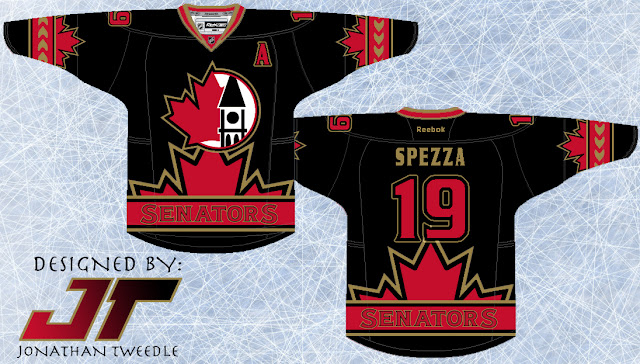
I See Your Stars and Stripes and I Raise You Some Canadian Heritage: Ottawa Senators

I must have designed the Rangers jersey and the Senators jersey pretty close together cuz both of them scream patriotism to the max!  This Senators jerseys sports the shoulder patch the Sens used to wear with the parliament building crested together with a maple leaf.  From there I decided to use the maple leaf as the focal point of the rest of the jersey; putting it on the bottom of the jersey and the sleeves.  While it looks a bit cluttered I like how it turned out:


Original Concept From 2003:


Friday 23 March 2012

The Star Spangled Jersey Project: New York Rangers

Alrighty, you ready for this?  This could be the most American jersey known to man! And although Washington D.C is the capital of the States, New York is definitely the most well known city and people usually associate New York when they think of the States.
So, as you can see I've made this jersey as patriotic as I possibly could and to be honest, it turned out ALOT better than I thought it would.  Don't think I need to explain much beyond that but I did make it so that (including the back of the jersey) there would be 50 stars on the jersey just like the flag, Enjoy!


Original Concept from 2003:


Monday 19 March 2012

Finally, Some NEW JERSEY's for the DEVILS

See what I did there?! Clever huh...

But seriously, the New Jersey Devils have had the same jerseys (pretty much) since the early 90's and before that the only real difference before that was that instead of black the Devils dawned the green to...compliment?....the red and white.
So with that in mind take a look at my new concepts: First off I've changed the logo just a bit, and now we have both the letters N and J separated styling some devilish features.  And the jersey itself, I'm pretty sure if I can remember back to 2004 when I drew the concept is just kind of random.  Doesn't really have any significance to the club but it looks pretty cool.

Which one do you like better; the Red or the Black?

Red Concept


Black Concept


New NJ Logo:


Original Concept From 2004:


Monday 12 March 2012

A Mediocre Monday Afternoon Montreal Design

The Montreal Canadiens jerseys, are a classic, since the 70s their jerseys have changed very little.  That being said when trying to figure out what to do with the Habs 8 years ago I didn't really have any ground breaking ideas and to be honest, what I came up with, to me is only "meh".  And I promise that when I design a new tabs jersey after I make it through all my 2003-04 design it will be much better than this one, PROMISE!


Original Concept From 2004:


Friday 9 March 2012

The WILD West: Seriously, This Jersey is Wild!

Let me reiterate the fact that I don't claim to think all of my jersey designs back from 2003 are amazing, in fact this one is quite "unique" and I don't even really think I like it that much.  Although I made an updated version of it without a key element and it looks much better but I have to show you both designs so you can see the difference.
As you can see I've taken the trees from within the Wild logo and put them at the bottom of the jersey creating a Phoenix Coyotes like "Mural Jersey" although the trees look pretty cool I think.  Then I've taken the text "WILD" and put the outline on both sleeves to add some more character to the jersey.  Finally you will notice an awkward triangle-ly striping thing at the top that I don't really like.  It makes the jersey look like it has a cape, weird, so I took it out of the 2nd design and I think the jersey looks way better without it.
 One thing I really DO like is the black, WILD logo and when I start making new designs for each team I think I will be bringing this bad boy back!  Enjoy, or, throw up, which ever one comes first after seeing these jerseys:

Design With "Cape Stripes"


Updated Design Without "Cape Stripes"


Original Concept From 2003:


Monday 5 March 2012

Putting Some Purple Back into the Kings Repertoire

This jersey is pretty out there, I'll be the first to admit it.  And I never claimed that all my design were awesome.  I find myself on the fence about this particular one.  One thing is for sure, I do think the kings need to bring the purple back, maybe not THIS much purple but when I get the chance to make a new kings concept I'll definitely be using purple as an accent colour for sure!
The design itself is pretty random, don't really remember why I made random circle thingy's on the sleeve to be honest, but the kings on the bottom is a tribute the their old black and purple jerseys that said "Los Angeles" on the bottom.  And the 2 crowns on the bottom of the sleeve, well come on, that just looks sweet!  The logo is an alternate logo the used to use, and I think it looks pretty sweet if I do say myself! anyways hope you guys enjoy!


Original Concept From 2003;


Saturday 3 March 2012

A Closer look at the Barrage

here's a closer look at the primary logo for the Saskatoon Barrage, and the Vimy ridge commemorative patch.
I made both of these logos on my own by mashing up like 7 pictures and editing them to make them look the way the do, hope you guys like it!

Primary Logo:

Vimy Ridge Patch:


Friday 2 March 2012

Introducing the SASKATOON BARRAGE

Hey guys, so as I stated in my last post I've been working on something big for a contest I've entered, if I win they will produce my jersey and give it to me as a prize!!
The contest required me to create a new team for another Canadian city, in anticipation/hopes that the coyotes could be coming north of the border.

Here it is with a write up (a bit lengthy but very interesting) about why I did what I did;

Home Concept:


Away concept:


Saskatoon Barrage:

The inspiration behind this concept is Canada’s involvement in the Battle of Vimy Ridge in April of 1917.
The primary logo I’ve created shows a Canadian soldier standing onto of the Ridge with the Canadian flag over his head, obviously (as this is a hockey team) the flag pole is a hockey stick.

I also created a Vimy Ridge commemoration shoulder patch.  The main focus of this shoulder patch is the monument that stands in memory of this historic battle in Vimy.  Below the monument are 4 different coloured squares, although these squares seem random and a bit tacky, they are actually the colours of each of the 4 Canadian divisions that fought in the Battle of Vimy Ridge.  The monument is encircled by a beige circle with the Words “VIMY RIDGE 1917” written in gold, again paying tribute to Canada’s involvement in the battle.

The other solider patch is a version of the chevrons worn by a sergeant in the Canadian Army.

The name “BARRAGE” is also closely tied to this tribute to Vimy Ridge.  The rolling barrage was the tactic the Canadians used to defeat the Germans at Vimy Ridge.  In this tactic, the artillery would fire at the enemy while the foot soldiers advanced towards the enemy's position.  This tactic had never been used before.  The use of the rolling barrage is one of the main reasons the Canadian army was so successful in being victorious at Vimy Ridge.

I’ve also tried to make the jersey design itself, as unique as possible.  Instead of just making a simple design to compliment the logo I decided to make the jersey as unique as the logo.  That being said, I’ve tried to make the sides look similar to the chevron design, adding the maple leaf at the bottom to make it more Canadian.

The choice of Saskatoon itself was pretty simple.  When one thinks about the province of Saskatchewan they associate the colour green with it, and a team paying tribute to the Canadian military had to be green, so Saskatoon was a natural fit.  The battle of Vimy Ridge is a proud moment in history for all Canadians so the Barrage could have worked with many different cities, but Saskatoon just seemed right.