Showing posts with label Minnesota. Show all posts

Saturday, 23 February 2013

Rebrand Series: Wild 3rds

I guess you could say this type of concept is starting to become my trademark.  I don't know what it is about this type of design, but I think it looks awesome.  It looks, classic, slick, clean, but unique and modern as well.
I've taken the elements from the current wild logo and put them into the jersey design.  The trees accenting the green parts of the jersey and the Star that forms the eye of the logo at the bottom of the jersey to add just another element of uniqueness to this concept.  Finally, I've created a black version of the current Wild logo because, well, because it looks pretty sweet...hopefully.

New Minnesota Wild 3rd Jersey:


Thursday, 14 February 2013

Rebrand Series: Minnesota Wild

This concept is Wild, straight up! this logo is one of the first I created when I decided to rebrand the entire NHL.  I've been sitting on it for a while now, uncertain of how I should go about making a jersey fit for the logo.
I completely understand that both the logo and the concept are out in left field, but with a nickname like the WILD, why not attempt to give some real meaning behind the name with a logo and jersey set that match the name.
The logo is meant to strike fear into opponents, with 2 glaring eyes staring at you through the scratch marks, and the WILD text just so you don't forget who you're afraid of.
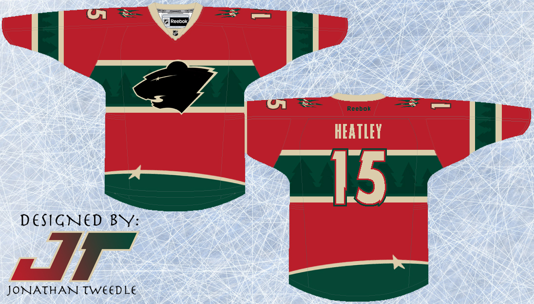
With a logo that is so primal, I had to design a jersey set that matched the logo's intensity.  Overall I wanted the jersey to look like it had just been attacked by the very beast I was trying to portray with the logo.  That being said, I didn't want it to look tacky and random, which I why I struggled with the jerseys for so long.  In the end, I tried to capture the essence of a classic hockey jersey but on the edge of crossing that line.  Finally, you will notice that the Wild away jersey is beige not white.  Simply put the Wild own that beige look, and the white just doesn't look right.

New Wild Logo:


New Minnesota Wild Home Jerseys:


New Minnesota Wild Away Jerseys:


Friday, 9 March 2012

The WILD West: Seriously, This Jersey is Wild!

Let me reiterate the fact that I don't claim to think all of my jersey designs back from 2003 are amazing, in fact this one is quite "unique" and I don't even really think I like it that much.  Although I made an updated version of it without a key element and it looks much better but I have to show you both designs so you can see the difference.
As you can see I've taken the trees from within the Wild logo and put them at the bottom of the jersey creating a Phoenix Coyotes like "Mural Jersey" although the trees look pretty cool I think.  Then I've taken the text "WILD" and put the outline on both sleeves to add some more character to the jersey.  Finally you will notice an awkward triangle-ly striping thing at the top that I don't really like.  It makes the jersey look like it has a cape, weird, so I took it out of the 2nd design and I think the jersey looks way better without it.
 One thing I really DO like is the black, WILD logo and when I start making new designs for each team I think I will be bringing this bad boy back!  Enjoy, or, throw up, which ever one comes first after seeing these jerseys:

Design With "Cape Stripes"


Updated Design Without "Cape Stripes"


Original Concept From 2003: