Showing posts with label Atlantic. Show all posts

Sunday, 1 December 2013

Rebrand Series: Devils 3rds

It's only natural that if the Devils get a 3rd jersey it should be black.  When I was designing this jersey I wanted to go for the old school look but as I was designing I had a small change of heart and realized I wanted a modern take on an old school look.
The result is the following:

New New Jersey Devils 3rd Jersey:


Thursday, 21 November 2013

Rebrand Series: New Jersey Devils

I have to make a confession, I've never really liked the Devils jerseys, it just seems like there is something missing and they haven't tapped into their full potential.  With that in mind I struggled for a long time to what a rebrand would look like for the Devils.  I'm not claiming to have all the answers, in fact I will be the first one to admit that this jersey set is quite out there.
The inspiration behind the logo was the fact that the Devils have needed an updated, more intimidating pitch fork in their repertoire.  I took ASU Sun Devils pitch fork logo and modified it a bit and gave it a little more substance with the NJ and wrap it up with a circle.
From the pitch fork logo I created a unique striping pattern that I've slapped on those jerseys.  Like I said, it's a bold step and not necessarily the answer to the rebrand for the Devils but I am straight out of ideas for this team.  with the exception of the 3rd jersey I've got in the works for next week:

New Devils Logo:


New New Jersey Devils Home Jersey:


New New York Jersey Devils Away Jersey:


Friday, 28 June 2013

Rebrand Series: Flyers 3rds

I can't remember the last time I actually posted a concept on a Friday morning like I've said I would, wow feels good to be back on top of the ball with this stuff, thanks for your patience.
Numerous times throughout their recent history, the Flyers have attempted to use a black jersey in their rotation.  I haven't been opposed to these jersey but they haven't been the best, which is why I think they keep getting rid of them.  That being said I've taken my theory of simplicity that I applied to the Flyers home and away set I posted last week and directly applied it to a black 3rd jersey.  In fact, the 3rd jersey is exactly the same design as the home and away set but with black as the primary colour and orange as the accent.  Clean, simple, and loving the orange accent, I think it works.
Because I used the same jersey design I did want to treat you guys to some sort of alternate logo.  And while I was hesitant to remove the liberty bell from my new Flyers logo when I did, I was pleasantly surprised at how the doubled sided Flyers logo looked.  And so here it is, enjoy:

New Flyers Alternate Logo:


New Philadelphia Flyers 3rd Jersey:


Saturday, 22 June 2013

Rebrand Series: Philadelphia Flyers

The Flyers have got something going for them that no other team in the NHL has...ORANGE.  The bright orange looks incredible on the Flyers jersey and I wanted to make sure that I didn't want to take anything away from this rare colour.  With that in mind I had a difficult time designing a jersey that did this, which is why the Flyers is one of the last jerseys I've posted in my rebrand series.
I tried a bunch of different ideas; some unique and others were just variations of things that have done before but nothing seemed to be working.  That's when I realized, I had to simplify the look to give the orange the look it deserved.
The logo was pretty easy to decide on.  With how awesome my Red Wings logo turned out I figured I'd try the same thing with it's winged counterpart, the Flyers logo.  With that in mind I angled the two sides slightly because it looks awkward when no angled, and most notably, I've added the liberty bell, perhaps the most famous landmark in Philly.  finding a good picture of the liberty bell turned out to be more difficult than I thought so I've used the Philadelphia Phillies logo and changed it to Flyers orange, and I gotta say, I'm liking the way it turned out.

New Flyers Logo:


New Philadelphia Flyers Home Jersey:


New Philadelphia Flyers Away Jersey:


Sunday, 19 May 2013

Rebrand Series: Islanders 3rds

As I've mentioned before, although the Islanders went through an awkward era (the fisherman logo) there was some good that came of it.  The fact that during that time they also used a logo with a lighthouse on it was a bright spot in a dark place.
That lighthouse is the focal point of my 3rd jersey for the Islanders.  It is a simplistic look, much like the Lightning have done when the rebranded; I've taken an "icon" from the team's history/the essence of what the team is all about and made a very simple, yet aesthetically pleasing look for them.
From there I took the jerseys the Islanders currently wear and put all of the lines and stripes on a slant to continue with the consistency of the jersey and the logo.  Finally, I've given the Islanders their retro blue back because it is a good look, although I think the Navy is a more solid primary look for them.

New Islanders Alternate Logo:


New New York Islanders 3rd Jersey:


Saturday, 11 May 2013

Rebrand Series: New York Islanders

The Islanders are one of a handful of teams that have decided to go back to their retro colour scheme which I think is good AND bad. On the one hand yes, the royal blue and orange look good together but on the other the retro trend is taking away from a team's ability to break the mould, get away from the cookie cutter jersey designs and go with something boldly unique.  Here's where I step in.
Personally I think the navy blue and orange is a great look for the Islanders so I've adopted this scheme as the primary colour scheme in my rebranded design.
The jersey looks much different than anything the Islanders have ever seen.  I took the unique design for the sides of the jersey from the Islanders current 3rd jersey, which is a travesty in itself, but I made those stripes work on a normal looking jersey.  I've also some slanted stripes that run up half the sleeve with the inspiration coming from shoulder patch the Islanders wore on the jerseys they wore when the edge jerseys were first introduced.
The logo I've created is a sort of homage to various looks the Islanders have had in their history.  From their original logo (which the are using currently as their primary logo again) I've taken the NY text and combined it with the ISLANDERS text that you may remember from that memorable logo they used with the angry fisherman on it.  Finally I took the lighthouse from that same era, but subtly straightened it vertically and combined all these elements to make this uniquely New York logo.  I tried to find a way to incorporate long island into the logo but it just didn't fit, PLUS they will be moving to Brooklyn soon anyways so it still works pending that move ( sorry Long Islanders):

New Islanders Logo:


New New York Islanders Home Jersey:


New New York Islanders Away Jersey:


Saturday, 9 March 2013

Rebrand Series: Penguins 3rds

The Penguins have had a couple of different 3rds in the past few years and one thing remains the same whenever the bring in a new one, bring back the blue.  Seeing the penguins in blue just seems weird to me, although I wasn't alive back when they actually wore blue, but something has always seemed off too me.
It may sound simple but having yellow in the Penguins logo on a blue jersey just seems tacky to me.  That's why when making a Penguins 3rd didn't necessarily think I needed to get rid of the blue jersey but instead change the logo to fit the jersey.
The jersey design is an old one that the Penguins used back in the 80s in blue and then switched to the black and yellow with the same design.  I brought it back with a few tweaks, most notably using different hues of blue both navy and sky.
The logo is the same as the one used in the Penguins rebranded home and away jerseys but I took out the yellow and used the 2 blues in a gradient pattern to make it a little less tacky.
I know it's a little out of the ordinary but what do you think?

New Pittsburgh Penguins 3rd Jersey:


Friday, 1 March 2013

Rebrand Series: Pittsburgh Penguins

For those of you who have dug deep into the archives of my jersey designs since I started this blog, you may have remembered that I designed a "new" Penguins logo.  At first you may not notice anything different than the one they currently use, however at a second glance you should notice two things: 1. that the Penguin is facing the opposite way as the real logo, and 2. that the Penguin is winding up for a slap shot as apposed to having his stick on the ice.
Well, I've taking that logo and tweaked it even more to add a little Tweedle flare to my Penguins rebrand concept.  I think I will dub it the best of both era's logo.  As you can see I've kept "my penguin" although I've flipped him to the original direction of the real logo.  Additionally, I've taken the 90s Penguin logo and placed him in the background with some slight modifications to make him look more modern.  At first I thought that perhaps it may be too busy, having 2 Penguins as the focal point, but the more I look at it, the more I am beginning to love this logo.
That is only half the battle, the second half is the jersey itself which is also a blending of era's.  I've taken the basic design of the jerseys that the Penguins used just prior to the Reebok edge era and mixed it in with the Penguins infamous late 90s gradient jersey.  Obviously, I've updated the colour palette and what has been created is what you see before you.

So....what do you think?

New Penguins Logo:


New Pittsburgh Penguins Home Jersey:


New Pittsburgh Penguins Away Jersey:


Monday, 28 January 2013

Rebrand Series: Rangers 3rds

As promised I've created a new alternate logo for the Rangers using the Liberty Torch.  When working on this logo I played around with a few different ideas; first off I left the torch by itself but I looked like something was missing, then I put a silhouette of the head of lady liberty but didn't get positive feedback on it, finally I put the modernized Rangers shield as the background and there you have it.
The jersey is a combination of 2 jerseys the Rangers have used in the past with a twist I've added on my own.  Most obviously, the bottom stripes are inspired by the home jerseys the Rangers currently use and have used since the beginning of time it seems like.  The arm stripes are a version of the stripes used on an alternate the Rangers used from 96-07, but I've switched the colours.  Finally, as inspired by the shield used in the logo, I've put a zigzag pattern on both sets of stripes to make it consistent with the jersey.  I've brought back the "classic" Rangers blue and red and although I'm not 100% sold on the jersey design, I can definitely see it growing on me.

New Rangers Alternate Logo:


New New York Rangers 3rd Jersey:


Friday, 11 January 2013

Rebrand Series: New York Rangers

I've gotta say, this new logo is, I believe my best work.  I've been waiting so long to unveil this jersey set to you guys but for the longest time I couldn't get a jersey design that did justice for the new logo.  As you can see that inspiration didn't happen until the world juniors were on.  As much as it pains me to say as a Canadian, the team USA jerseys are sweet, I love the design and as a result I decided to use that design to give my new Rangers logo a proper home.  While the design itself is quite simple, it draws your attention to the important elements of the jersey, it's classic, just like the Rangers history.  Over the years the Rangers have changed their logo and jerseys minimally so I decided it was time for a change.
The first thing you will notice is that the blue used in the jersey is much darker than the "classic" Rangers blue.  I think it just looks better, more intimidating, and it fits better with the logo.  I am working on a 3rd jersey that will definitely pay homage to the "classic" Rangers blue so don't worry.  You might also notice that I've created a new shoulder patch for the team as well, now sporting the liberty torch on both arms, this logo is also in the plans for the 3rd jersey I will be posting next.
Finally, and most importantly take a look at the new Rangers logo.  I can't even tell you how long it took to make this one, many many hours, that's for sure.  But as you can see I've combined the famous Rangers crest with the modern, Statue of Liberty logo they used on a jersey a number of years ago.  But it wasn't enough to just use the shape of the Statue of Liberty, in fact it looked quite tacky at first, which is why I've "burned" the head of Lady Liberty into the logo crest.  The logo is a very modern looking crest and I've done this because it fits the flow of the jersey set much better than a classic crest.  Well, I've already said this my favorite logo I've designed thus far, what do you guys think?

New Rangers Logo:


New New York Rangers Home Jersey:


New New York Rangers Away Jersey:


Monday, 9 April 2012

The End of the Passive Penguin

The first thing you'll notice with my Penguins jersey is the new design on the jersey itself.  I can't say I remember what I was thinking when I made the design back in 2004, but I improved it and personally, I think it looks pretty sweet.

What you might not notice at first glance is that I've changed the logo.  The first thing I've done is, change the direction the penguin is facing, usually he is facing the left but I've got him facing the right.  Secondly, and this is the focus of the new logo, is that I've got him taking a slap shot.  What I'm trying to do is make the penguin a little more intimidating instead of just skating around with his stick on the ice.  It may not be a huge difference but for me, I think it makes the logo a lot more awesome, just saying:


Slap Shot Penguin Logo:


Original Concept From 2004:


Monday, 2 April 2012

Is it Always Sunny In Philadelphia?

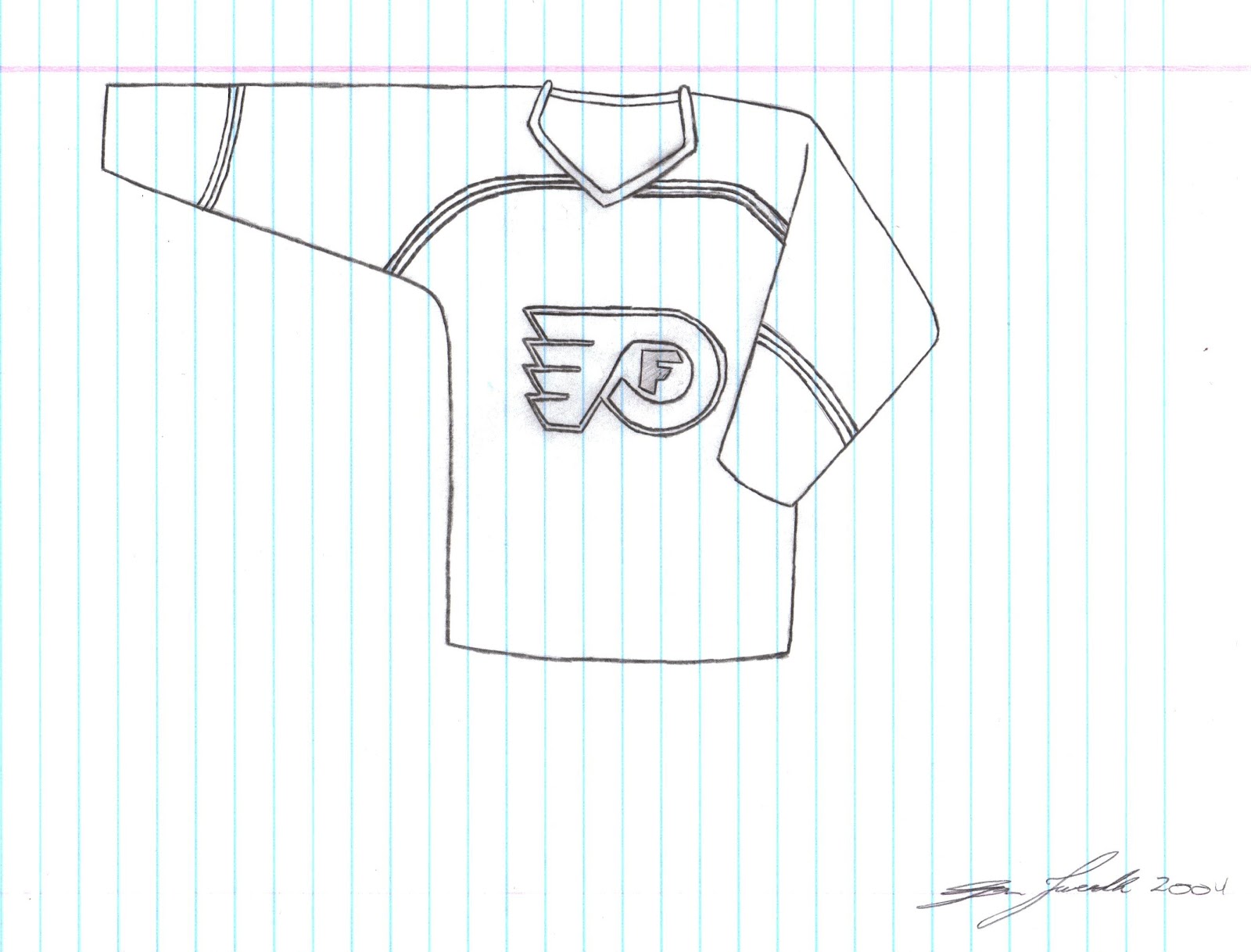
I guess I wasn't feeling very creative back in 2004 when I made the original design for this Flyers jersey.  While Yes, I slightly changed the logo and added an F for Flyers within the flying P logo the design itself is not much different than what they actually wore back in 2004.  I didn't want to cop out and use the same colour scheme they actually use so I switched the black and white and I'll be the first one to admit....this jersey is kind of MEH!

This is a Tweedle guarantee, next time I make a Flyers jersey it will be MUCH better, already have some ideas for a new logo that includes the Liberty Bell and pilot wings....


Original Concept From 2004:


Friday, 23 March 2012

The Star Spangled Jersey Project: New York Rangers

Alrighty, you ready for this?  This could be the most American jersey known to man! And although Washington D.C is the capital of the States, New York is definitely the most well known city and people usually associate New York when they think of the States.
So, as you can see I've made this jersey as patriotic as I possibly could and to be honest, it turned out ALOT better than I thought it would.  Don't think I need to explain much beyond that but I did make it so that (including the back of the jersey) there would be 50 stars on the jersey just like the flag, Enjoy!


Original Concept from 2003:


Monday, 19 March 2012

Finally, Some NEW JERSEY's for the DEVILS

See what I did there?! Clever huh...

But seriously, the New Jersey Devils have had the same jerseys (pretty much) since the early 90's and before that the only real difference before that was that instead of black the Devils dawned the green to...compliment?....the red and white.
So with that in mind take a look at my new concepts: First off I've changed the logo just a bit, and now we have both the letters N and J separated styling some devilish features.  And the jersey itself, I'm pretty sure if I can remember back to 2004 when I drew the concept is just kind of random.  Doesn't really have any significance to the club but it looks pretty cool.

Which one do you like better; the Red or the Black?

Red Concept


Black Concept


New NJ Logo:


Original Concept From 2004:


Friday, 20 January 2012

You be the Judge: Islanders Jersey

DISCLAIMER: All (with the exception of the rebranded ducks and capitals 3rds) of my jersey concepts thus far were originally created 8 years ago, and as I'm taking a look back I'm thinking about some of them "What was I thinking?!", and this Islanders jersey is one of them.  I am not claiming that these jerseys are all amazing and I'm still up in the air about this one

At the time I created this jersey the Islanders had JUST got rid of their ridiculous fisherman logo and went back to the old school NY logo.  At the very least I decided that instead of the fisherman the Islanders could use the shoulder patch that was on those jerseys, a lighthouse.  At least the lighthouse doesn't look at random as a fisherman, I mean if you stretch it out a bit, when you think of an island you would think of a lighthouse before you thought of a fisherman.

I've also made the striping wavy to give it that islandy feel and to pay homage to those ridiculous fisherman jerseys that sported a similar, but not as polished wave design.


Original 2003 Concept: