Showing posts with label New Logo. Show all posts

Saturday, 21 December 2013

Rebrand Series: Blues 3rds

And with this I have officially rebranded the entire NHL!
I'll keep it short and sweet, I love the Ottawa Senators black and red heritage jersey and so I've taken it and applied the Blues colour palette and it looks pretty sweet!
I've kept the arch from the other jerseys to keep that continuity and whoop there it is!
Finally I've taken the music note part of the actual Blues logo and incorporated it into my version of the Treble clef.  In my previous logo I went for the out of the ordinary, wing logo but this time I wanted to pay tribute to the musical roots of the team name.
Enjoy!

New Blues Alternate Logo:


New St. Louis Blues 3rd Jersey:


Sunday, 15 December 2013

Rebrand Series: St. Louis Blues

At long last I've finally reached the end of this massive project I call the Rebrand series! The final instalments of the Rebrand series focuses on the St. Louis Blues.
The logo kind of came about randomly; I was playing around with the wing part of the Blues logo and decided to give it the same treatment I gave the Red Wings logo by mirroring one side and seeing what it looked like.  I can't fully explain what it's supposed to be, but I think it looks pretty awesome! I then used the circle the Blues use in their 3rd jersey logo.
When I was redesigning the jersey I knew I wanted to somehow incorporate the famous arches somehow and for a long time it just seemed tacky and out of place.  Finally I figured out how to subtly include the arches and still keep the St. Louis feel to the rest of the jersey, and the result was this beauty:

New Blues Logo:


New St. Louis Blues Home Jersey:


New St. Louis Blues Away Jersey:


Thursday, 21 November 2013

Rebrand Series: New Jersey Devils

I have to make a confession, I've never really liked the Devils jerseys, it just seems like there is something missing and they haven't tapped into their full potential.  With that in mind I struggled for a long time to what a rebrand would look like for the Devils.  I'm not claiming to have all the answers, in fact I will be the first one to admit that this jersey set is quite out there.
The inspiration behind the logo was the fact that the Devils have needed an updated, more intimidating pitch fork in their repertoire.  I took ASU Sun Devils pitch fork logo and modified it a bit and gave it a little more substance with the NJ and wrap it up with a circle.
From the pitch fork logo I created a unique striping pattern that I've slapped on those jerseys.  Like I said, it's a bold step and not necessarily the answer to the rebrand for the Devils but I am straight out of ideas for this team.  with the exception of the 3rd jersey I've got in the works for next week:

New Devils Logo:


New New Jersey Devils Home Jersey:


New New York Jersey Devils Away Jersey:


Friday, 8 November 2013

Rebrand Series: Leafs 3rds

Similar to the Winter classic jersey I designed for the Red Wings, I went with the old school stripe style jersey and borrowed the beige colour jersey from the Rangers winter classic jersey from a few years back.
The logo isn't much but the encircled leaf adds to the antique feel of the complete concept so I'm hoping it all plays off each other.

New Leafs Alternate Logo:


New Toronto Maple Leafs 3rd Jersey:


Sunday, 13 October 2013

Rebrand Series: Toronto Maple Leafs

The Leafs are one of those teams that "change" their jerseys quite often.  That being said the changes they've made over the last 10 years have literally been switching back between 2 different jersey sets that look essentially the same.  Not only that but they've introduced the same 3rd jersey a couple of times (before and directly after the Reebok edge era) until recently they've been using a blue 3rd jersey AND unveiled their winter classic jersey as well.
With all of that in mind I decided that when it was all said and done the Leafs just need a Fresh, New Look something the fans haven't seen before.
The inspiration for the logo was the 2010 Vancouver Olympics Team Canada logo which acts as a template as for my new Leafs logo.  In the center is the TML wordmark that the team has used on and off for a very long time.  Acting as a background to the TML are a couple of things; the veins of a leaf to pay homage to the old school leaf Toronto has used on the white 3rd jersey as well as the CN tower, THE Toronto landmark.  I've done the best I can to make sure the CN tower blends in as naturally as possible with the veins of the leaf so that it doesn't look too tacky.
The jerseys themselves were my biggest obstacle, I fumbled around with a couple of ideas; 1 set had a very old school feel to them but eventually I decided that if I was using a "modern" new logo I should also go with a modern new jersey set.  After several weeks of just looking at these 2 options I finally settled on these 2 jerseys and I hope they compliment the new logo well:

New Maple Leafs Logo:


New Toronto Maple Leafs Home Jersey:


New Toronto Maple Leafs Away Jersey:


Monday, 16 September 2013

Rebrand Series: Tampa Bay Lightning

I've said it before but the Lightning have so much potential for an out of the box jersey design with a name like the Lightning.  In fact, I've posted one I designed way back when.  This time around I've improved upon my design and made a New home and away version of my original design.
I know it's not a brand new logo or completely new design but I love how it turned out, and I promise I have some new Lightning logos in the works.
In the meantime, enjoy a new rendition of an old favorite of mine:

New Lightning Logo:


New Tampa Bay Lightning Home Jersey:


New Tampa Bay Lightning Away Jersey:


Sunday, 8 September 2013

Rebrand Series: Capitals 3rds

I know you've seen this jersey before but I can explain.  I've always liked the idea of the Caps having a Blue version of their current home/away jersey set, but I've done that already so, I went with a new version of my rebranded Flyers jersey.  It has a certain familiarity about it, being very comparable to the Caps actual design but also an element of simplification.
The Logo, just kind of came out of know where, I was looking at some sort of soccer logo and then all of a sudden got an idea that turned into this.  I can't really give you any rhyme or reason as to why it turned out this way but hey, it looks pretty decent:

New Capitals Alternate Logo:


New Washington Capitals 3rd Jersey:


Monday, 2 September 2013

Rebrand Series: Washington Capitals

The Capitals logo is cool, but I just think there is so much untapped potential with the eagle logo they have in their arsenal that isn't really being used.  As a result I have made it my mission to incorporate the eagle into almost every Capitals logo I've made.  My newest rendition includes the US Capitol (did you guys even know the bottom of the eagle is in the shape of the Capitol, MIND BLOWN) and of course I had to ad some stars and stripes to make it a little more American.
The jersey design itself comes from an All-Star jersey back from 1991-92.  Personally, I wouldn't have ever even known about these jerseys unless my boy Drake didn't represent one of them at the NHL All-Star game a few years ago in Ottawa.  When I was reminded of this jersey I knew I'd have to use them for one of my designs.  I've added another stripe to the bottom of the jersey to jazz it up a bit but other than that, this design need not any improvement.

New Capitals Logo:


New Washington Capitals Home Jersey:


New Washington Capitals Away Jersey:


Tuesday, 13 August 2013

Rebrand Series: Nashville Predators

This is a much different look for the Preds.  While they actually rebranded their uniforms last season and went with a simplified, Nashvill-esque look, MY rebrand is very much the opposite!
Very similar to my rebrand attempt for the Panthers and the Wild (there's just so much potential with those 3 animal logos) I've gone for a more intimidating look that would strike fear into the eyes of any opponent.
When I created the new logo I wanted to keep the Sabre tooth tiger in the forefront but had a vision of what it would look like if it was facing frontwards.  But that wasn't enough, it looked to bland so I added some scratch marks and the NP that the Preds currently use just in case anyone forgot where these guys came from.
The jerseys don't really need much explanation.  I wanted something different, the jerseys had to match the logo, and they look awesome!

New Predators Logo:


New Nashville Predators Home Jersey:


New Nashville Predators Away Jersey:


Friday, 2 August 2013

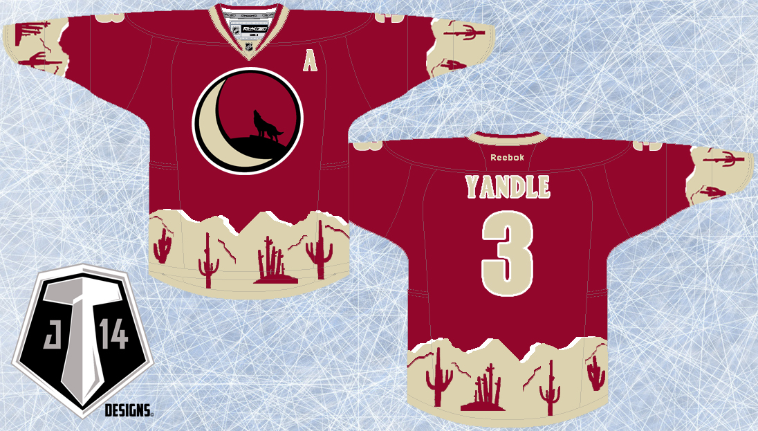
Rebrand Series: Coyotes 3rds

As promised I have come up with a new idea for the Coyotes.  And yes, it is another blending of eras; let's start with the logo.
To make this logo I've taken 3 logos that the Yotes have used in their past and blended them all together to pay homeage to the history of this team.  In the foreground I've taken the original Coyote head logo back from the late 90s and updated the colour scheme.  Then, I've encircled this logo with one that the Coyotes currently have in their arsenal minus the giant paw in the middle.  And just to add a little more depth I've taken the state of Arizona logo thats used as a shoulder patch and faintly put it in the background.
The jersey design itself is yet another shout out to the past.  In fact I've taken the Coyotes original home/away jersey and updated it to fit the modern look they rep now.  I'm not quite sure what 8-bit original Nintendo pattern is supposed to be but hey, it's all good!

New Coyotes Alternate Logo:


New Phoenix Coyotes 3rd Jersey:


Thursday, 25 July 2013

Rebrand Series: Phoenix Coyotes

SURPRISE!!! Happy Thursday: I'll be on a Safari all weekend so I figured I'd give you guys a post today while I have internet access.
Now there is a disclaimer and that is to tell you that half of this concept you have seen before.  When I was trying to come up with ideas for some new Coyotes jerseys I kept coming back to the original concept I posted a long time ago.  The thing was, to me, something looked off in that concept.  With much thought a deliberation I realized that I didn't like the shade of maroon that I used and so I decided that I'd give the same concept another try with a deeper hue of maroon.
That being said I've also created an away jersey with the same design which hasn't been seen yet so although this post is kind of an update on an older design I hope I've made it up to you by giving you an away jersey as well.
And maybe a little teaser about the 3rd jersey I'll be posting next week: It will be another blending of eras much different than the home and away jerseys I've created but just as cool.

New Coyotes Logo:


New Phoenix Coyotes Home Jersey:


New Phoenix Coyotes Away Jersey:


Monday, 8 July 2013

Rebrand Series: Vancouver Canucks

When I took on the challenge of Rebranding the Vancouver Canucks I had no idea what I was going to do, or where I was going to start.  Initially, I grabbed the black, red, and yellow logo the Canucks used to use back in the 90s and simply changed the colour scheme to the Canucks present colours.  I was satisfied, It looked sharp, it was simple and I felt people would love to see me bring back the retro logo.  But something wasn't sitting right for me, I felt as if I was taking the easy way out by not actually creating my own logo.  As a result I sat on this mystery for many months with no progress and then one day it just dawned on me; if I do this properly, I can incorporate the Canucks current whale logo into the beloved 90s logo, and so the task began.  I took a long time to perfect the blend but I'm very happy with the result.
The jersey design itself has a couple different elements going on too.  First, I took the striping on the bottom of the jersey from the throwback jersey the Canucks have worn on several occasions in the last couple of years.  Secondly, and most notably I've given the Canucks slanted lines on the sleeves and taken a chunk of the line out with the idea that the absence of line forms a V for Vancouver within the design.  Overall I think it turned out pretty sweet, I'm especially proud of the logo:

Canucks New Logo:


New Vancouver Canucks Home Jersey:


New Vancouver Canucks Away Jersey:


Friday, 28 June 2013

Rebrand Series: Flyers 3rds

I can't remember the last time I actually posted a concept on a Friday morning like I've said I would, wow feels good to be back on top of the ball with this stuff, thanks for your patience.
Numerous times throughout their recent history, the Flyers have attempted to use a black jersey in their rotation.  I haven't been opposed to these jersey but they haven't been the best, which is why I think they keep getting rid of them.  That being said I've taken my theory of simplicity that I applied to the Flyers home and away set I posted last week and directly applied it to a black 3rd jersey.  In fact, the 3rd jersey is exactly the same design as the home and away set but with black as the primary colour and orange as the accent.  Clean, simple, and loving the orange accent, I think it works.
Because I used the same jersey design I did want to treat you guys to some sort of alternate logo.  And while I was hesitant to remove the liberty bell from my new Flyers logo when I did, I was pleasantly surprised at how the doubled sided Flyers logo looked.  And so here it is, enjoy:

New Flyers Alternate Logo:


New Philadelphia Flyers 3rd Jersey:


Saturday, 22 June 2013

Rebrand Series: Philadelphia Flyers

The Flyers have got something going for them that no other team in the NHL has...ORANGE.  The bright orange looks incredible on the Flyers jersey and I wanted to make sure that I didn't want to take anything away from this rare colour.  With that in mind I had a difficult time designing a jersey that did this, which is why the Flyers is one of the last jerseys I've posted in my rebrand series.
I tried a bunch of different ideas; some unique and others were just variations of things that have done before but nothing seemed to be working.  That's when I realized, I had to simplify the look to give the orange the look it deserved.
The logo was pretty easy to decide on.  With how awesome my Red Wings logo turned out I figured I'd try the same thing with it's winged counterpart, the Flyers logo.  With that in mind I angled the two sides slightly because it looks awkward when no angled, and most notably, I've added the liberty bell, perhaps the most famous landmark in Philly.  finding a good picture of the liberty bell turned out to be more difficult than I thought so I've used the Philadelphia Phillies logo and changed it to Flyers orange, and I gotta say, I'm liking the way it turned out.

New Flyers Logo:


New Philadelphia Flyers Home Jersey:


New Philadelphia Flyers Away Jersey:


Saturday, 25 May 2013

Rebrand Series: Montréal Canadiens

Before you start yelling blasphemy I realize that the Canadiens jerseys are considered sacred and so before anyone freaks out I'll clear the air right off the bat, I've made small, simple changes to enrich the history surrounding this team.
With that said let's talk about the logo: Simply put, I've taken the current Habs logo and slapped it on top of a version of the globe logo they used way back in the 1920s.  I've tried to take two eras of the most historic team and blend them together to create a unique new look.
The jerseys are a version of what the Canadiens use now.  The Home jersey is pretty much the same except you may notice that I've taken the two thin stripes off the bottom of the jersey.  That's not all, I've also put a faint deep blue print of the world map inspired by the 1920s globe logo.  The away version is the exact opposite of its home counterpart which IS a big step away from the norm for them, but sometimes we should embrace change.

New Canadiens Logo:


New Montréal Canadiens Home Jersey:


New Montréal Canadiens Away Jersey:


Sunday, 19 May 2013

Rebrand Series: Islanders 3rds

As I've mentioned before, although the Islanders went through an awkward era (the fisherman logo) there was some good that came of it.  The fact that during that time they also used a logo with a lighthouse on it was a bright spot in a dark place.
That lighthouse is the focal point of my 3rd jersey for the Islanders.  It is a simplistic look, much like the Lightning have done when the rebranded; I've taken an "icon" from the team's history/the essence of what the team is all about and made a very simple, yet aesthetically pleasing look for them.
From there I took the jerseys the Islanders currently wear and put all of the lines and stripes on a slant to continue with the consistency of the jersey and the logo.  Finally, I've given the Islanders their retro blue back because it is a good look, although I think the Navy is a more solid primary look for them.

New Islanders Alternate Logo:


New New York Islanders 3rd Jersey:


Saturday, 11 May 2013

Rebrand Series: New York Islanders

The Islanders are one of a handful of teams that have decided to go back to their retro colour scheme which I think is good AND bad. On the one hand yes, the royal blue and orange look good together but on the other the retro trend is taking away from a team's ability to break the mould, get away from the cookie cutter jersey designs and go with something boldly unique.  Here's where I step in.
Personally I think the navy blue and orange is a great look for the Islanders so I've adopted this scheme as the primary colour scheme in my rebranded design.
The jersey looks much different than anything the Islanders have ever seen.  I took the unique design for the sides of the jersey from the Islanders current 3rd jersey, which is a travesty in itself, but I made those stripes work on a normal looking jersey.  I've also some slanted stripes that run up half the sleeve with the inspiration coming from shoulder patch the Islanders wore on the jerseys they wore when the edge jerseys were first introduced.
The logo I've created is a sort of homage to various looks the Islanders have had in their history.  From their original logo (which the are using currently as their primary logo again) I've taken the NY text and combined it with the ISLANDERS text that you may remember from that memorable logo they used with the angry fisherman on it.  Finally I took the lighthouse from that same era, but subtly straightened it vertically and combined all these elements to make this uniquely New York logo.  I tried to find a way to incorporate long island into the logo but it just didn't fit, PLUS they will be moving to Brooklyn soon anyways so it still works pending that move ( sorry Long Islanders):

New Islanders Logo:


New New York Islanders Home Jersey:


New New York Islanders Away Jersey:


Saturday, 4 May 2013

Rebrand Series: Blue Jackets 3rds

Yes, they are named the Blue Jackets but the Blue 3rd jersey that they use right now just doesn't really fit in with the rest of the identity of the team.  Therefore I have stepped out of the box on this one and decided to make a red Blue Jackets jersey.
I wanted to give the jersey a rustic, vintage feel and the old school striping successfully does this I think.  You may also notice that I have used something very similar to their current 3rd jersey logo, but the focal point of this logo is not a cannon.  Instead I've used the civil war cap in the middle of the 3rd logo crest and changed the colour scheme of that crest to eliminated the powder blue from the mix.
Although it's red I think this look works really well for the Blue Jackets:

New Blue Jackets Alternate Logo:


New Columbus Blue Jackets 3rd Jersey:


Friday, 26 April 2013

Rebrand Series: Columbus Blue Jackets

When I first thought up this Rebrand idea the Blue Jackets were one of the first teams I had logo ideas for.  I while back I created a version of the logo posted with this concept but after months of holding off on revealing it to you I noticed that it looked kind of sloppy.  Over the last few weeks I've been making small, subtle tweaks to clean it up and bring it up to par with the standard I have set for myself.
The Cannon, a great idea, the jersey and logo design that the Cannon currently rests on, not so much.  The blue, powder blue and beige jersey set the Blue Jackets currently use as their 3rds just doesn't work in my opinion.  That being said there are elements that I've kept in this re-invisioning of incorporating the Cannon into my Rebranded Blue Jackets concept.
I've taken the Cannon, added the Ohio flag that they used on their 10th anniversary logo and placed it upon their current shoulder patch logo and created, what I think is a solid logo.
The jerseys themselves are not a radical change from what we know the Blue Jackets for as well but I think I have improved the design.  Taking the Patriotic colour scheme and obvious homage the team is paying to the State's historical significance I've created a striping pattern that is supposed to draw an obvious resemblance to the Ohio State flag.  I really like the way the Blue Jackets use the stripes going across the sleeves of their current jerseys, So I kept them, to make it uniquely Columbus.

New Blue Jackets Logo:


New Columbus Blue Jackets Home Jersey:


New Columbus Blue Jackets Away Jersey: