Showing posts with label Northwest. Show all posts

Monday, 22 July 2013

Rebrand Series: Canucks 3rds

I am currently in South Africa for 5 weeks and internet is not as readily available as I'm used to so, I apologize for the lack of posts in the last 2 weeks.

This past season the Canucks brought back a maroon Millionaires jersey which I thought was pretty awesome.  This jersey inspired me to create my own version of this jersey to fit in with the rebranding efforts I've made for the Canucks.  First off, the Canucks need a green jersey, the lack of green in the NHL is a travesty and thus, there really wasn't an option, the jersey had to be green.  additionally I've added a blue trim to the white sleeve stripes.
Finally, I've wanted to add that Lumberjack logo that the Canucks use on their merchandise but never knew how, until they unveiled the millionaires logo they'd be using.  As a result, this is what I've come up with:

New Canucks Alternate Logo:


New Vancouver Canucks 3rd Jersey:


Monday, 8 July 2013

Rebrand Series: Vancouver Canucks

When I took on the challenge of Rebranding the Vancouver Canucks I had no idea what I was going to do, or where I was going to start.  Initially, I grabbed the black, red, and yellow logo the Canucks used to use back in the 90s and simply changed the colour scheme to the Canucks present colours.  I was satisfied, It looked sharp, it was simple and I felt people would love to see me bring back the retro logo.  But something wasn't sitting right for me, I felt as if I was taking the easy way out by not actually creating my own logo.  As a result I sat on this mystery for many months with no progress and then one day it just dawned on me; if I do this properly, I can incorporate the Canucks current whale logo into the beloved 90s logo, and so the task began.  I took a long time to perfect the blend but I'm very happy with the result.
The jersey design itself has a couple different elements going on too.  First, I took the striping on the bottom of the jersey from the throwback jersey the Canucks have worn on several occasions in the last couple of years.  Secondly, and most notably I've given the Canucks slanted lines on the sleeves and taken a chunk of the line out with the idea that the absence of line forms a V for Vancouver within the design.  Overall I think it turned out pretty sweet, I'm especially proud of the logo:

Canucks New Logo:


New Vancouver Canucks Home Jersey:


New Vancouver Canucks Away Jersey:


Saturday, 23 February 2013

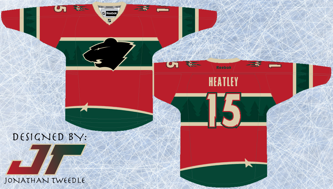
Rebrand Series: Wild 3rds

I guess you could say this type of concept is starting to become my trademark.  I don't know what it is about this type of design, but I think it looks awesome.  It looks, classic, slick, clean, but unique and modern as well.
I've taken the elements from the current wild logo and put them into the jersey design.  The trees accenting the green parts of the jersey and the Star that forms the eye of the logo at the bottom of the jersey to add just another element of uniqueness to this concept.  Finally, I've created a black version of the current Wild logo because, well, because it looks pretty sweet...hopefully.

New Minnesota Wild 3rd Jersey:


Thursday, 14 February 2013

Rebrand Series: Minnesota Wild

This concept is Wild, straight up! this logo is one of the first I created when I decided to rebrand the entire NHL.  I've been sitting on it for a while now, uncertain of how I should go about making a jersey fit for the logo.
I completely understand that both the logo and the concept are out in left field, but with a nickname like the WILD, why not attempt to give some real meaning behind the name with a logo and jersey set that match the name.
The logo is meant to strike fear into opponents, with 2 glaring eyes staring at you through the scratch marks, and the WILD text just so you don't forget who you're afraid of.
With a logo that is so primal, I had to design a jersey set that matched the logo's intensity.  Overall I wanted the jersey to look like it had just been attacked by the very beast I was trying to portray with the logo.  That being said, I didn't want it to look tacky and random, which I why I struggled with the jerseys for so long.  In the end, I tried to capture the essence of a classic hockey jersey but on the edge of crossing that line.  Finally, you will notice that the Wild away jersey is beige not white.  Simply put the Wild own that beige look, and the white just doesn't look right.

New Wild Logo:


New Minnesota Wild Home Jerseys:


New Minnesota Wild Away Jerseys:


Friday, 8 February 2013

Rebrand Series: Oilers 3rds

Originally, I was going to use this logo as the primary mark for my rebranded Oilers designs.  When my creative juices finally started flowing I replaced the spawn logo with a creation of my own, but I knew I had to bring it back in some capacity.  The Spawn logo is easily my favourite of all the Oilers logos and all I've done is change the colours to match the orange and navy colour scheme used for this new 3rd jersey I've designed.
The jersey design is nothing complex, but the simplicity is what makes it stand out for me.  I brought back the Oilers navy that they rocked before the throwbacks became their primary, but instead of going with the bronzy orange, I used the throwback orange with really makes the colours pop on the jersey.  Kind of a simple design, but I hope you guys like it.

Updated Spawn Logo:


New Edmonton Oilers 3rd Jerseys:


Saturday, 2 February 2013

Rebrand Series: Edmonton Oilers

When I was designing a jersey and logo for the Oilers I originally decided to just take the "Spawn" logo that the Oilers used on their 3rds prior to the Reebok edge era and change the colours to reflect the Oilers current palette.  Everything was all good, logo fit and I designed the jersey to pay tribute to 3 different styles the Oilers have worn in their past.
The striping on the jersey is inspired by the striping from the jerseys the Oilers wore just prior to the Reebok edge era.  In addition to the stripes I've taken an element from the Reebok edge jerseys in which the arm stripes only go up half way, giving the jersey a little more of a modern look.  Finally, and quite simply I've used the Oilers retro colour scheme because, to be honest, the colour scheme they used before was pretty dull.
I was ready to post the jerseys a while ago, but for some reason I hesitated because I felt like i was copping out by not actually designing my own logo.  So, last week I was finally hit with an idea, which has finally materialized into a logo I'm proud to post.  In the foreground is an oil drill, the element I was struggling with for the longest time, but I finally found on that fits into the look of the design.  I then layered the Oilers current text mark over top of the drill, and put the Edmonton skyline in the background.  Finally, the shape of the border was loosely inspired by the Oilers AHL affiliate the Oklahoma City Barons.

New Oilers logo:


New Edmonton Oilers Home Jersey:


New Edmonton Oilers Away Jersey:


Friday, 21 September 2012

Rebrand Series: Avalanche 3rds

To keep it short and simple the avs have tried and failed to represent a jersey where the primary colour is blue.  Here is my attempt in correcting that path; as you can see I've brought back the "mountain" effect for the sleeves of the jersey but left it off the bottom, instead I gave it a more modern, rounded feel to balance the jersey out.  I've also combined the Avalanche's primary logo with their shoulder patch to create this "new" logo.

3rd Jersey Logo:


New Avalanche 3rds:


Thursday, 13 September 2012

Rebrand Series: Colorado Avalanche

It's been a while since I've posted anything, life has been crazy lately.  I'm hoping this post will make up for the lack of jersey love on my behalf.
The Colorado Avalanche haven't really changed their branding since they entered the league, their logo has stayed virtually the same with a few colour tweaks and a similar jersey style even with the introduction of the Reebok edge jerseys.  One thing the Avs are infamous for ugly third jerseys!!!
While my new jersey designs aren't drastically different, they are different enough. I've kept the blue sleeves to contrast the maroon and I think it blends quite well.  The bottom striping is my attempt at making it look like an avalanche sweeping across, hoping it doesn't look tacky.
Finally, and what I've worked the hardest on for this jersey set is the new logo.  Simply put, I've mashed the Avalanche's current logo with their former identity the Rockies logo.  Adding the most recognizable components of each gives the logo a classic modern, authentic contemporary feel, if that makes any sense at all.  I've replaced the C that quarterbacks the Rockies logo with the C that Joe Sakic wore on his chest for oh so long.
Although it's been a while I hope this concept makes up for lost time:

New Avalanche Logo:


Colorado Avalanche Home Jersey:


Colorado Avalanche Away Jersey:


Friday, 20 July 2012

Rebrand Series: Flames 3rd

I know you guys have already seen this jersey but I've now demoted it to my new 3rd for the rebranded flames.  I still really love this jersey, looks retro but awesome! enjoy:


Sunday, 15 July 2012

Rebrand Series: Calgary Flames

While I posted a Flames jersey not too long ago, I went back to the drawing board.  I kept thinking to myself, there has got to be something cool I could do to make a new Flames logo.  I decided to take a page out of Tampa Bay's rebranding techniques, simple is good.  With that In mind I designed a logo that focuses on the more crucial part of Calgary's identity, the Flame.

With all of that in mind I took a swing at a new set of jerseys to go along with the new logo.  The jerseys that the Flames use now are pretty cool, but the black doesn't sit well with me, in my opinion it seems misplaced.  So, I took the black out and decided to keep with the retro colour scheme because, in my opinion the Orangey-Red, Yellow, and White is one of the best colour schemes in the league.  I kept the jersey design almost identical to the design it is now, but revamped the colour scheme, and took out the awkward black patch underneath the armpit.
What do you guys think?

New Flames Logo:


Calgary Flames Home Jerseys:


Calgary Flames Away Jerseys:


Monday, 30 April 2012

Colour Confusion Part 2

Another shout out goes to my buddy Jeff, my partner in crime back in high school, who redesigned our Canucks jersey to give it some modern day flare.  If you guys remember back in the 90's when the Canucks had the 3rd jersey that had a gradient effect on it turning from red to blue, well Jeff has recreated this using the blue and green the Canucks use today with the same features are its predecessor:


I've also recreated it to show what it would look like for reals:


Friday, 27 April 2012

Colour Confusion: Vancouver Canucks

Of all the teams that have rebranded themselves over the course of their history  the Vancouver Canucks have had one of the most drastic changes.  From starting off with blue white and green, then to the infamous yellow black and red, they then switched to navy maroon silver and a lighter blue and have just recently gone back to the green and blue.
Back in 2003, when I first made this design, the jersey was relevant: the Canucks were still using the navy maroon silver and a lighter blue colour scheme and I threw on their original logo (before they started using it again I swear!).  In hindsight, I would say this jersey is pretty sweet, if they still used those colours:


Original Concept From 2003:


Friday, 9 March 2012

The WILD West: Seriously, This Jersey is Wild!

Let me reiterate the fact that I don't claim to think all of my jersey designs back from 2003 are amazing, in fact this one is quite "unique" and I don't even really think I like it that much.  Although I made an updated version of it without a key element and it looks much better but I have to show you both designs so you can see the difference.
As you can see I've taken the trees from within the Wild logo and put them at the bottom of the jersey creating a Phoenix Coyotes like "Mural Jersey" although the trees look pretty cool I think.  Then I've taken the text "WILD" and put the outline on both sleeves to add some more character to the jersey.  Finally you will notice an awkward triangle-ly striping thing at the top that I don't really like.  It makes the jersey look like it has a cape, weird, so I took it out of the 2nd design and I think the jersey looks way better without it.
 One thing I really DO like is the black, WILD logo and when I start making new designs for each team I think I will be bringing this bad boy back!  Enjoy, or, throw up, which ever one comes first after seeing these jerseys:

Design With "Cape Stripes"


Updated Design Without "Cape Stripes"


Original Concept From 2003:


Monday, 27 February 2012

Re- SPAWN-ing an old look for the Oilers

Let me start this post by saying that The Oilers 3rd jersey from 2001-2007 was the COOLEST jersey ever!! when it first came out I thought it was the most awesome jersey of life, I still love it, in fact I have a Oilers 3rd Jersey with Mike York on the back....yes Mike York, please don't ask me why I have a Mike York jersey lol but I love the oilers 3rd from 2001!!!
Oh and for those of you who also don't know the logo used on that jersey was designed by the creator of Spawn, hence the post title.
Anyways when i created this design it was because I really wanted the Oilers to rebrand and use the 3rds as a primary jersey and my design as their away jerseys.  And to be honest I still think they should use that jersey combo, the retro jerseys are cool but come on, these ones are original, the retros had their glory days back in the 80s.
I took part of the shoulder logo from that 3rd jersey and made it the primary logo and kept it pretty simple for the jersey striping, hope you guys enjoy!


Original Concept From 2003;


Friday, 10 February 2012

Adding Some Heat to the Flames


Today is your lucky day, because included in this post is actually 3 jersey design and the original concept.  The reason....I'm very indecisive.  The jersey concept itself is pretty straightforward; I added flames to the flames jersey instead of just having different kinds of striping.  REMEMBER, I made this concept back in 2003 and am in no way saying that these jerseys are the best I've ever created.  I'm still out on whether or not I like the design hence the fact that I made 3 different versions of it.  I think this design could work but not exactly which color scheme suits it best.  Let me know what you guys think; do you like the design? Which color scheme works best with the flames?

Flames Current Color Scheme


Flames Retro Color Scheme


Flames 2003 Color Scheme


Original Concept from 2003;


Friday, 13 January 2012

New Avalanche 3rds

I have to admit I have always liked the Avalanche logo.  As plain as the letter A is, they decided to spruce it up and create a scene incorporating the letter.  Too bad they didn't take the same creativity into making their current 3rd jerseys.  I mean, having the word Colorado diagonally down the front of a jersey and changing the colour scheme, how original!  If you are going to change the colour scheme at least do something cool to the rest of the jersey, like this;


That Big foot logo has been around for as long as the Avs have been in the league, so why not put it to good use?!  I've also tried to incorporate the unique striping the Avs use to circle their logo; as you can see the oval surrounding the foot is much more than slapping a random oval to encompass the logo.  I have taken the same theory and applied it to the white accent striping of my concept, I believe adding a very unique, genuine Avs feel to the concept.  I've also included my original concept of this jersey and as you can see I have added the coloured shoulders because when I created the jersey without the purple shoulders the jersey looked a little bland, enjoy.