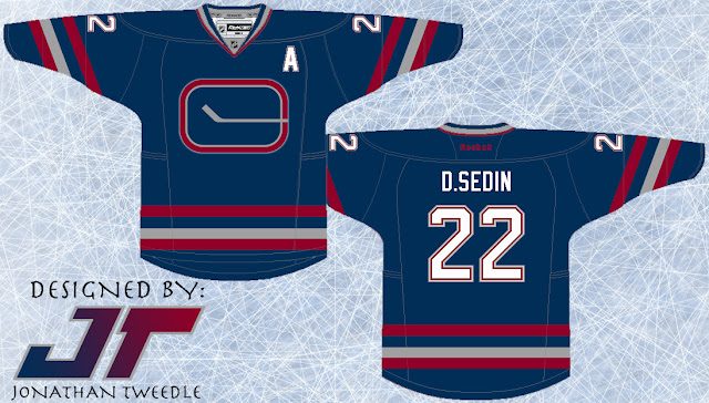
I've also recreated it to show what it would look like for reals:
Showing posts with label Nucks. Show all posts
Showing posts with label Nucks. Show all posts
Monday, 30 April 2012
Colour Confusion Part 2
Another shout out goes to my buddy Jeff, my partner in crime back in high school, who redesigned our Canucks jersey to give it some modern day flare. If you guys remember back in the 90's when the Canucks had the 3rd jersey that had a gradient effect on it turning from red to blue, well Jeff has recreated this using the blue and green the Canucks use today with the same features are its predecessor:
Friday, 27 April 2012
Colour Confusion: Vancouver Canucks
Of all the teams that have rebranded themselves over the course of their history the Vancouver Canucks have had one of the most drastic changes. From starting off with blue white and green, then to the infamous yellow black and red, they then switched to navy maroon silver and a lighter blue and have just recently gone back to the green and blue.
Back in 2003, when I first made this design, the jersey was relevant: the Canucks were still using the navy maroon silver and a lighter blue colour scheme and I threw on their original logo (before they started using it again I swear!). In hindsight, I would say this jersey is pretty sweet, if they still used those colours:
Back in 2003, when I first made this design, the jersey was relevant: the Canucks were still using the navy maroon silver and a lighter blue colour scheme and I threw on their original logo (before they started using it again I swear!). In hindsight, I would say this jersey is pretty sweet, if they still used those colours:
Original Concept From 2003:
Subscribe to:
Posts (Atom)


