Thursday 21 November 2013

Rebrand Series: New Jersey Devils

I have to make a confession, I've never really liked the Devils jerseys, it just seems like there is something missing and they haven't tapped into their full potential.  With that in mind I struggled for a long time to what a rebrand would look like for the Devils.  I'm not claiming to have all the answers, in fact I will be the first one to admit that this jersey set is quite out there.
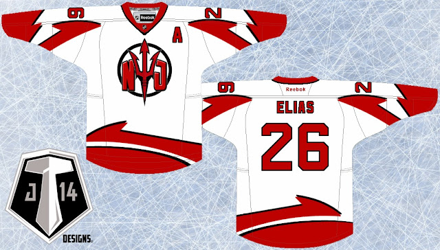
The inspiration behind the logo was the fact that the Devils have needed an updated, more intimidating pitch fork in their repertoire.  I took ASU Sun Devils pitch fork logo and modified it a bit and gave it a little more substance with the NJ and wrap it up with a circle.
From the pitch fork logo I created a unique striping pattern that I've slapped on those jerseys.  Like I said, it's a bold step and not necessarily the answer to the rebrand for the Devils but I am straight out of ideas for this team.  with the exception of the 3rd jersey I've got in the works for next week:

New Devils Logo:


New New Jersey Devils Home Jersey:


New New York Jersey Devils Away Jersey:


Friday 8 November 2013

Rebrand Series: Leafs 3rds

Similar to the Winter classic jersey I designed for the Red Wings, I went with the old school stripe style jersey and borrowed the beige colour jersey from the Rangers winter classic jersey from a few years back.
The logo isn't much but the encircled leaf adds to the antique feel of the complete concept so I'm hoping it all plays off each other.

New Leafs Alternate Logo:


New Toronto Maple Leafs 3rd Jersey: