Showing posts with label 3rd Jersey. Show all posts

Saturday, 21 December 2013

Rebrand Series: Blues 3rds

And with this I have officially rebranded the entire NHL!
I'll keep it short and sweet, I love the Ottawa Senators black and red heritage jersey and so I've taken it and applied the Blues colour palette and it looks pretty sweet!
I've kept the arch from the other jerseys to keep that continuity and whoop there it is!
Finally I've taken the music note part of the actual Blues logo and incorporated it into my version of the Treble clef.  In my previous logo I went for the out of the ordinary, wing logo but this time I wanted to pay tribute to the musical roots of the team name.
Enjoy!

New Blues Alternate Logo:


New St. Louis Blues 3rd Jersey:


Sunday, 1 December 2013

Rebrand Series: Devils 3rds

It's only natural that if the Devils get a 3rd jersey it should be black.  When I was designing this jersey I wanted to go for the old school look but as I was designing I had a small change of heart and realized I wanted a modern take on an old school look.
The result is the following:

New New Jersey Devils 3rd Jersey:


Friday, 8 November 2013

Rebrand Series: Leafs 3rds

Similar to the Winter classic jersey I designed for the Red Wings, I went with the old school stripe style jersey and borrowed the beige colour jersey from the Rangers winter classic jersey from a few years back.
The logo isn't much but the encircled leaf adds to the antique feel of the complete concept so I'm hoping it all plays off each other.

New Leafs Alternate Logo:


New Toronto Maple Leafs 3rd Jersey:


Sunday, 29 September 2013

Rebrand Series: Lightning 3rds

Before the Lightning rebranded a couple of years ago and switched to Blue as their primary colour they've been without a Black jersey.  Frankly, I loved the black jerseys they wore before the rebrand and I knew I'd have to bring black back when I rebranded the team.
With that in mind here is what I've done; I've taken the Bolts current 3rd jersey and reversed the colour scheme.  I'd like the believe that this change works pretty well and the result is a pretty sweet jersey:

New Tampa Bay Lightning 3rd jersey:


Sunday, 8 September 2013

Rebrand Series: Capitals 3rds

I know you've seen this jersey before but I can explain.  I've always liked the idea of the Caps having a Blue version of their current home/away jersey set, but I've done that already so, I went with a new version of my rebranded Flyers jersey.  It has a certain familiarity about it, being very comparable to the Caps actual design but also an element of simplification.
The Logo, just kind of came out of know where, I was looking at some sort of soccer logo and then all of a sudden got an idea that turned into this.  I can't really give you any rhyme or reason as to why it turned out this way but hey, it looks pretty decent:

New Capitals Alternate Logo:


New Washington Capitals 3rd Jersey:


Friday, 16 August 2013

Rebrand Series: Predators 3rds

So my rebranded home and away jerseys for the Predators were a definite break from the mould, but I do want to say that I am a big fan of the rebrand efforts that they've made for real.  The yellow jersey was a bold move and I personally think it looks great.  so with that in mind I knew that if I went with a blue home jersey I'd have to do a yellow 3rd.
The jersey is simple, yet different.  Who knew that the absence of lines could look so cool?!  AND, I've tried to keep it clean and simple with many similarities to what they actually wear.  The logo is from the Preds word mark that they introduced when they rebranded last year.  In the words of Michael Scott; This jersey is BOSS!

New Nashville Predators 3rd Jersey:


Friday, 2 August 2013

Rebrand Series: Coyotes 3rds

As promised I have come up with a new idea for the Coyotes.  And yes, it is another blending of eras; let's start with the logo.
To make this logo I've taken 3 logos that the Yotes have used in their past and blended them all together to pay homeage to the history of this team.  In the foreground I've taken the original Coyote head logo back from the late 90s and updated the colour scheme.  Then, I've encircled this logo with one that the Coyotes currently have in their arsenal minus the giant paw in the middle.  And just to add a little more depth I've taken the state of Arizona logo thats used as a shoulder patch and faintly put it in the background.
The jersey design itself is yet another shout out to the past.  In fact I've taken the Coyotes original home/away jersey and updated it to fit the modern look they rep now.  I'm not quite sure what 8-bit original Nintendo pattern is supposed to be but hey, it's all good!

New Coyotes Alternate Logo:


New Phoenix Coyotes 3rd Jersey:


Monday, 22 July 2013

Rebrand Series: Canucks 3rds

I am currently in South Africa for 5 weeks and internet is not as readily available as I'm used to so, I apologize for the lack of posts in the last 2 weeks.

This past season the Canucks brought back a maroon Millionaires jersey which I thought was pretty awesome.  This jersey inspired me to create my own version of this jersey to fit in with the rebranding efforts I've made for the Canucks.  First off, the Canucks need a green jersey, the lack of green in the NHL is a travesty and thus, there really wasn't an option, the jersey had to be green.  additionally I've added a blue trim to the white sleeve stripes.
Finally, I've wanted to add that Lumberjack logo that the Canucks use on their merchandise but never knew how, until they unveiled the millionaires logo they'd be using.  As a result, this is what I've come up with:

New Canucks Alternate Logo:


New Vancouver Canucks 3rd Jersey:


Friday, 28 June 2013

Rebrand Series: Flyers 3rds

I can't remember the last time I actually posted a concept on a Friday morning like I've said I would, wow feels good to be back on top of the ball with this stuff, thanks for your patience.
Numerous times throughout their recent history, the Flyers have attempted to use a black jersey in their rotation.  I haven't been opposed to these jersey but they haven't been the best, which is why I think they keep getting rid of them.  That being said I've taken my theory of simplicity that I applied to the Flyers home and away set I posted last week and directly applied it to a black 3rd jersey.  In fact, the 3rd jersey is exactly the same design as the home and away set but with black as the primary colour and orange as the accent.  Clean, simple, and loving the orange accent, I think it works.
Because I used the same jersey design I did want to treat you guys to some sort of alternate logo.  And while I was hesitant to remove the liberty bell from my new Flyers logo when I did, I was pleasantly surprised at how the doubled sided Flyers logo looked.  And so here it is, enjoy:

New Flyers Alternate Logo:


New Philadelphia Flyers 3rd Jersey:


Friday, 14 June 2013

Rebrand Series: Canadiens 3rds

First off, a thousand apologies for leaving you guys hanging these last 3 weeks.  Year end stuff has school has gotten the better of me and I have had next to no time to post anything.
So without further ado, I give you a re-imagined concept of a throwback jersey the Habs wore during their centennial season.  It is essentially the same jersey, but I've decluttered it (although it may not feel like it) by putting less stripes on it and giving it just a hint more blue because although the Habs have worn red since anyone can remember, the blue looks good, and the jersey is an instant classic.
The logo is a combination of 2 logos the Canadiens used back in the early 1900s.  The maple leaf was used in 1911, while the CA logo was used a few years later in 1915.  Simply put I've combined to historical eras of the rich history that is the Montréal Canadiens and put a new twist on a classic jersey from deep in the archives.

New Canadiens Alternate logo:


New Montréal Canadiens 3rd Jersey:


Sunday, 19 May 2013

Rebrand Series: Islanders 3rds

As I've mentioned before, although the Islanders went through an awkward era (the fisherman logo) there was some good that came of it.  The fact that during that time they also used a logo with a lighthouse on it was a bright spot in a dark place.
That lighthouse is the focal point of my 3rd jersey for the Islanders.  It is a simplistic look, much like the Lightning have done when the rebranded; I've taken an "icon" from the team's history/the essence of what the team is all about and made a very simple, yet aesthetically pleasing look for them.
From there I took the jerseys the Islanders currently wear and put all of the lines and stripes on a slant to continue with the consistency of the jersey and the logo.  Finally, I've given the Islanders their retro blue back because it is a good look, although I think the Navy is a more solid primary look for them.

New Islanders Alternate Logo:


New New York Islanders 3rd Jersey:


Saturday, 4 May 2013

Rebrand Series: Blue Jackets 3rds

Yes, they are named the Blue Jackets but the Blue 3rd jersey that they use right now just doesn't really fit in with the rest of the identity of the team.  Therefore I have stepped out of the box on this one and decided to make a red Blue Jackets jersey.
I wanted to give the jersey a rustic, vintage feel and the old school striping successfully does this I think.  You may also notice that I have used something very similar to their current 3rd jersey logo, but the focal point of this logo is not a cannon.  Instead I've used the civil war cap in the middle of the 3rd logo crest and changed the colour scheme of that crest to eliminated the powder blue from the mix.
Although it's red I think this look works really well for the Blue Jackets:

New Blue Jackets Alternate Logo:


New Columbus Blue Jackets 3rd Jersey:


Saturday, 20 April 2013

Rebrand Series: Panthers 3rds

Not much to say about this one other than it is a colour variation of the Rebranded Panthers jerseys I posted last week.  Although the Panthers went back to red this past season (which was an excellent choice) they can still rock the blue...assuming there is no powder blue to go with it.
In terms of the logo, I've used the same logo I created for the Home and Away jerseys but took the text out to switch things up.  Although the changes aren't drastic I think overall these 3 jerseys give the Panthers a fresh new look and give them an edge in the intimidation factor.

New Florida Panthers 3rd Jersey:


Friday, 5 April 2013

Rebrand Series: Senators 3rds

Well, when I posted my Senators rebrand last week I swapped out the primary colour of red for black, but I couldn't just leave the red by the waste side so, behold my rebranded Senators 3rd jersey.
There isn't really any rhyme or reason for the design but as it came together it definitely started looking more and more Senator-esque.  The one element I did really want to incorporate into the design is arrow feather/branch looking things, seeing as they've been a part of the Sens logo for a very long time.
The logo is taken from the Heritage jerseys that the Sens brought into existence a couple of seasons ago.  In the end, it all comes together to give the senators another unique jersey design that compliments the past, present and future of the franchise.

New Ottawa Senators 3rd Jersey:


Saturday, 23 March 2013

Rebrand Series: Sharks 3rds

UMM, Ya I don't really have many words for this one.  Other than the fact that for some random reason I've been imagining a San Jose 3rd jersey with a tribal design.  I've never been to San Jose and I have no clue what it's like there but for some reason I've thought that a tribal jersey would be a good fit, I don't know.
Like I said, I don't really have any words and I know I'm gonna get a lot of haters for this jersey, but I've accepted that.

New San Jose Sharks 3rd Jersey:


Saturday, 9 March 2013

Rebrand Series: Penguins 3rds

The Penguins have had a couple of different 3rds in the past few years and one thing remains the same whenever the bring in a new one, bring back the blue.  Seeing the penguins in blue just seems weird to me, although I wasn't alive back when they actually wore blue, but something has always seemed off too me.
It may sound simple but having yellow in the Penguins logo on a blue jersey just seems tacky to me.  That's why when making a Penguins 3rd didn't necessarily think I needed to get rid of the blue jersey but instead change the logo to fit the jersey.
The jersey design is an old one that the Penguins used back in the 80s in blue and then switched to the black and yellow with the same design.  I brought it back with a few tweaks, most notably using different hues of blue both navy and sky.
The logo is the same as the one used in the Penguins rebranded home and away jerseys but I took out the yellow and used the 2 blues in a gradient pattern to make it a little less tacky.
I know it's a little out of the ordinary but what do you think?

New Pittsburgh Penguins 3rd Jersey:


Saturday, 23 February 2013

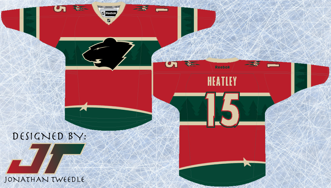
Rebrand Series: Wild 3rds

I guess you could say this type of concept is starting to become my trademark.  I don't know what it is about this type of design, but I think it looks awesome.  It looks, classic, slick, clean, but unique and modern as well.
I've taken the elements from the current wild logo and put them into the jersey design.  The trees accenting the green parts of the jersey and the Star that forms the eye of the logo at the bottom of the jersey to add just another element of uniqueness to this concept.  Finally, I've created a black version of the current Wild logo because, well, because it looks pretty sweet...hopefully.

New Minnesota Wild 3rd Jersey:


Friday, 8 February 2013

Rebrand Series: Oilers 3rds

Originally, I was going to use this logo as the primary mark for my rebranded Oilers designs.  When my creative juices finally started flowing I replaced the spawn logo with a creation of my own, but I knew I had to bring it back in some capacity.  The Spawn logo is easily my favourite of all the Oilers logos and all I've done is change the colours to match the orange and navy colour scheme used for this new 3rd jersey I've designed.
The jersey design is nothing complex, but the simplicity is what makes it stand out for me.  I brought back the Oilers navy that they rocked before the throwbacks became their primary, but instead of going with the bronzy orange, I used the throwback orange with really makes the colours pop on the jersey.  Kind of a simple design, but I hope you guys like it.

Updated Spawn Logo:


New Edmonton Oilers 3rd Jerseys:


Monday, 28 January 2013

Rebrand Series: Rangers 3rds

As promised I've created a new alternate logo for the Rangers using the Liberty Torch.  When working on this logo I played around with a few different ideas; first off I left the torch by itself but I looked like something was missing, then I put a silhouette of the head of lady liberty but didn't get positive feedback on it, finally I put the modernized Rangers shield as the background and there you have it.
The jersey is a combination of 2 jerseys the Rangers have used in the past with a twist I've added on my own.  Most obviously, the bottom stripes are inspired by the home jerseys the Rangers currently use and have used since the beginning of time it seems like.  The arm stripes are a version of the stripes used on an alternate the Rangers used from 96-07, but I've switched the colours.  Finally, as inspired by the shield used in the logo, I've put a zigzag pattern on both sets of stripes to make it consistent with the jersey.  I've brought back the "classic" Rangers blue and red and although I'm not 100% sold on the jersey design, I can definitely see it growing on me.

New Rangers Alternate Logo:


New New York Rangers 3rd Jersey:


Saturday, 8 December 2012

Rebrand Series: Kings 3rds

I know its been too long since my last post, I've had a hard time coming up a concept I liked for the Kings 3rds.  I went through a handful of different ideas on the jersey design itself, finally I landed on this one.
The inspiration behind the entire jersey was from all of the Los Angeles major sports teams.  first off the logo is a combination of the LA Dodgers logo and the crown from the kings.  Then, instead of using the dull purple the Kings used prior to their new threads, I've used the LA Lakers purple in junction with the classic black and silver the Kings wear so proudly.
The design, in a small way was also inspired by the Dodgers and Lakers as well.  Both teams have specific jersey sets that have a a solid line under the arm straight down to the bottom of the jersey.  I couldn't leave it plain so I also added a couple of stripes on the arms to even it out.

New Kings Alternate Logo:


New Los Angeles Kings 3rd Jersey: