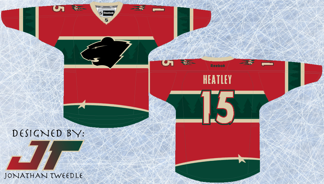
I've taken the elements from the current wild logo and put them into the jersey design. The trees accenting the green parts of the jersey and the Star that forms the eye of the logo at the bottom of the jersey to add just another element of uniqueness to this concept. Finally, I've created a black version of the current Wild logo because, well, because it looks pretty sweet...hopefully.
New Minnesota Wild 3rd Jersey: