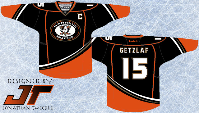
This is where I come in, I've taken that shoulder patch and made it the focal point of my Rebranded 3rd for the ducks. Going along side that I've tried to recreate a retro feel for the jersey, giving it similar, but different curvature and arm stripes as their original teal and maroon wonders. That being said I made the stripes come from the opposite side to make it more "up-to-date". I contemplated making the base colour for this jersey orange, but I thought it might be a little too much to handle on the eyes, who knows if I keep playing around with it I might find the perfect balance in order to make a sweet orange Ducks jersey, until then, enjoy:
Showing posts with label Anaheim. Show all posts
Showing posts with label Anaheim. Show all posts
Friday, 3 August 2012
Rebrand Series: Ducks 3rds
I've said this many times before and I'm going to say it again...The Ducks need to bring back the Wild Wing logo. They want to, you can tell, when the introduced their current 3rd jersey they put an updated version of the guy on their shoulder patch. Anaheim just fully commit to the Wild Wing, nobody likes your boring "ducks" text across the front anymore.
This is where I come in, I've taken that shoulder patch and made it the focal point of my Rebranded 3rd for the ducks. Going along side that I've tried to recreate a retro feel for the jersey, giving it similar, but different curvature and arm stripes as their original teal and maroon wonders. That being said I made the stripes come from the opposite side to make it more "up-to-date". I contemplated making the base colour for this jersey orange, but I thought it might be a little too much to handle on the eyes, who knows if I keep playing around with it I might find the perfect balance in order to make a sweet orange Ducks jersey, until then, enjoy:
This is where I come in, I've taken that shoulder patch and made it the focal point of my Rebranded 3rd for the ducks. Going along side that I've tried to recreate a retro feel for the jersey, giving it similar, but different curvature and arm stripes as their original teal and maroon wonders. That being said I made the stripes come from the opposite side to make it more "up-to-date". I contemplated making the base colour for this jersey orange, but I thought it might be a little too much to handle on the eyes, who knows if I keep playing around with it I might find the perfect balance in order to make a sweet orange Ducks jersey, until then, enjoy:
Monday, 30 July 2012
Rebrand Series: Anaheim Ducks
Let's be honest, bringing wild wing back needs to happen, we don't need
to the "Ducks" text with a duck foot D anymore. What I've done
is combine elements of ducks jerseys past and present to create these jerseys.
Taking a look at the home jersey first, I've combined elements of their
current home, 3rd, and original mighty ducks jerseys to make it. Elements
from the 3rd's are the orange shoulder stripes and the shoulder patches,
sporting the ducks D, so they still have their "new" identity, as
well as the arm sleeve patterns. If you know your ducks jerseys then
you'll also notice that I've changed the direction the stripes on the bottom of
the jersey are flowing, as dismal as this sounds the reasoning behind this
switch was deliberate. The new direction is actually an old one, the
original mighty ducks jerseys had their stripes flowing this way as well, but
I've kept the unique curvature and striping in current ducks colours to make it
pop out more.
Finally, I've added the ducks current D behind the logo, to pay tribute to the mighty ducks first logo (the duck goalie mask aka wild wing with the 2 hockey sticks crisscrossed like a pirate flag tribute), but have changed the colours inside the D to make the logo pop out more.
Finally, I've added the ducks current D behind the logo, to pay tribute to the mighty ducks first logo (the duck goalie mask aka wild wing with the 2 hockey sticks crisscrossed like a pirate flag tribute), but have changed the colours inside the D to make the logo pop out more.
New Ducks Logo:
Anaheim Ducks Home Jersey:
Anaheim Ducks Away Jersey:
Monday, 2 January 2012
The Return of the Mighty Ducks of Anaheim
I didn't realize how much I liked the maroon and greenish/teal jerseys the Ducks wore until they were gone, good times and many memories (D1, D2, D3 was a huge part of my childhood). The ducks NEED to bring back the Wild Wing logo ASAP! Other than that I switched the colours around but kept the same retro design.
Original Concept From 2003:
Subscribe to:
Posts (Atom)


