Saturday, 21 December 2013

Rebrand Series: Blues 3rds

And with this I have officially rebranded the entire NHL!
I'll keep it short and sweet, I love the Ottawa Senators black and red heritage jersey and so I've taken it and applied the Blues colour palette and it looks pretty sweet!
I've kept the arch from the other jerseys to keep that continuity and whoop there it is!
Finally I've taken the music note part of the actual Blues logo and incorporated it into my version of the Treble clef.  In my previous logo I went for the out of the ordinary, wing logo but this time I wanted to pay tribute to the musical roots of the team name.
Enjoy!

New Blues Alternate Logo:


New St. Louis Blues 3rd Jersey:


Sunday, 15 December 2013

Rebrand Series: St. Louis Blues

At long last I've finally reached the end of this massive project I call the Rebrand series! The final instalments of the Rebrand series focuses on the St. Louis Blues.
The logo kind of came about randomly; I was playing around with the wing part of the Blues logo and decided to give it the same treatment I gave the Red Wings logo by mirroring one side and seeing what it looked like.  I can't fully explain what it's supposed to be, but I think it looks pretty awesome! I then used the circle the Blues use in their 3rd jersey logo.
When I was redesigning the jersey I knew I wanted to somehow incorporate the famous arches somehow and for a long time it just seemed tacky and out of place.  Finally I figured out how to subtly include the arches and still keep the St. Louis feel to the rest of the jersey, and the result was this beauty:

New Blues Logo:


New St. Louis Blues Home Jersey:


New St. Louis Blues Away Jersey:


Sunday, 1 December 2013

Rebrand Series: Devils 3rds

It's only natural that if the Devils get a 3rd jersey it should be black.  When I was designing this jersey I wanted to go for the old school look but as I was designing I had a small change of heart and realized I wanted a modern take on an old school look.
The result is the following:

New New Jersey Devils 3rd Jersey:


Thursday, 21 November 2013

Rebrand Series: New Jersey Devils

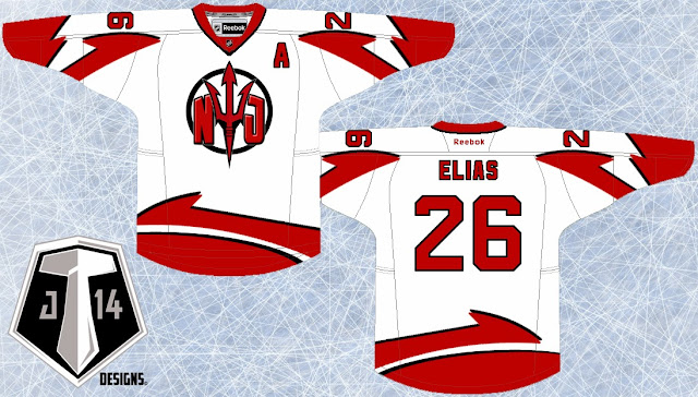
I have to make a confession, I've never really liked the Devils jerseys, it just seems like there is something missing and they haven't tapped into their full potential.  With that in mind I struggled for a long time to what a rebrand would look like for the Devils.  I'm not claiming to have all the answers, in fact I will be the first one to admit that this jersey set is quite out there.
The inspiration behind the logo was the fact that the Devils have needed an updated, more intimidating pitch fork in their repertoire.  I took ASU Sun Devils pitch fork logo and modified it a bit and gave it a little more substance with the NJ and wrap it up with a circle.
From the pitch fork logo I created a unique striping pattern that I've slapped on those jerseys.  Like I said, it's a bold step and not necessarily the answer to the rebrand for the Devils but I am straight out of ideas for this team.  with the exception of the 3rd jersey I've got in the works for next week:

New Devils Logo:


New New Jersey Devils Home Jersey:


New New York Jersey Devils Away Jersey:


Friday, 8 November 2013

Rebrand Series: Leafs 3rds

Similar to the Winter classic jersey I designed for the Red Wings, I went with the old school stripe style jersey and borrowed the beige colour jersey from the Rangers winter classic jersey from a few years back.
The logo isn't much but the encircled leaf adds to the antique feel of the complete concept so I'm hoping it all plays off each other.

New Leafs Alternate Logo:


New Toronto Maple Leafs 3rd Jersey:


Sunday, 13 October 2013

Rebrand Series: Toronto Maple Leafs

The Leafs are one of those teams that "change" their jerseys quite often.  That being said the changes they've made over the last 10 years have literally been switching back between 2 different jersey sets that look essentially the same.  Not only that but they've introduced the same 3rd jersey a couple of times (before and directly after the Reebok edge era) until recently they've been using a blue 3rd jersey AND unveiled their winter classic jersey as well.
With all of that in mind I decided that when it was all said and done the Leafs just need a Fresh, New Look something the fans haven't seen before.
The inspiration for the logo was the 2010 Vancouver Olympics Team Canada logo which acts as a template as for my new Leafs logo.  In the center is the TML wordmark that the team has used on and off for a very long time.  Acting as a background to the TML are a couple of things; the veins of a leaf to pay homage to the old school leaf Toronto has used on the white 3rd jersey as well as the CN tower, THE Toronto landmark.  I've done the best I can to make sure the CN tower blends in as naturally as possible with the veins of the leaf so that it doesn't look too tacky.
The jerseys themselves were my biggest obstacle, I fumbled around with a couple of ideas; 1 set had a very old school feel to them but eventually I decided that if I was using a "modern" new logo I should also go with a modern new jersey set.  After several weeks of just looking at these 2 options I finally settled on these 2 jerseys and I hope they compliment the new logo well:

New Maple Leafs Logo:


New Toronto Maple Leafs Home Jersey:


New Toronto Maple Leafs Away Jersey:


Sunday, 29 September 2013

Rebrand Series: Lightning 3rds

Before the Lightning rebranded a couple of years ago and switched to Blue as their primary colour they've been without a Black jersey.  Frankly, I loved the black jerseys they wore before the rebrand and I knew I'd have to bring black back when I rebranded the team.
With that in mind here is what I've done; I've taken the Bolts current 3rd jersey and reversed the colour scheme.  I'd like the believe that this change works pretty well and the result is a pretty sweet jersey:

New Tampa Bay Lightning 3rd jersey: