Monday, 2 September 2013

Rebrand Series: Washington Capitals

The Capitals logo is cool, but I just think there is so much untapped potential with the eagle logo they have in their arsenal that isn't really being used.  As a result I have made it my mission to incorporate the eagle into almost every Capitals logo I've made.  My newest rendition includes the US Capitol (did you guys even know the bottom of the eagle is in the shape of the Capitol, MIND BLOWN) and of course I had to ad some stars and stripes to make it a little more American.
The jersey design itself comes from an All-Star jersey back from 1991-92.  Personally, I wouldn't have ever even known about these jerseys unless my boy Drake didn't represent one of them at the NHL All-Star game a few years ago in Ottawa.  When I was reminded of this jersey I knew I'd have to use them for one of my designs.  I've added another stripe to the bottom of the jersey to jazz it up a bit but other than that, this design need not any improvement.

New Capitals Logo:


New Washington Capitals Home Jersey:


New Washington Capitals Away Jersey:


Friday, 16 August 2013

Rebrand Series: Predators 3rds

So my rebranded home and away jerseys for the Predators were a definite break from the mould, but I do want to say that I am a big fan of the rebrand efforts that they've made for real.  The yellow jersey was a bold move and I personally think it looks great.  so with that in mind I knew that if I went with a blue home jersey I'd have to do a yellow 3rd.
The jersey is simple, yet different.  Who knew that the absence of lines could look so cool?!  AND, I've tried to keep it clean and simple with many similarities to what they actually wear.  The logo is from the Preds word mark that they introduced when they rebranded last year.  In the words of Michael Scott; This jersey is BOSS!

New Nashville Predators 3rd Jersey:


Tuesday, 13 August 2013

Rebrand Series: Nashville Predators

This is a much different look for the Preds.  While they actually rebranded their uniforms last season and went with a simplified, Nashvill-esque look, MY rebrand is very much the opposite!
Very similar to my rebrand attempt for the Panthers and the Wild (there's just so much potential with those 3 animal logos) I've gone for a more intimidating look that would strike fear into the eyes of any opponent.
When I created the new logo I wanted to keep the Sabre tooth tiger in the forefront but had a vision of what it would look like if it was facing frontwards.  But that wasn't enough, it looked to bland so I added some scratch marks and the NP that the Preds currently use just in case anyone forgot where these guys came from.
The jerseys don't really need much explanation.  I wanted something different, the jerseys had to match the logo, and they look awesome!

New Predators Logo:


New Nashville Predators Home Jersey:


New Nashville Predators Away Jersey:


Friday, 2 August 2013

Rebrand Series: Coyotes 3rds

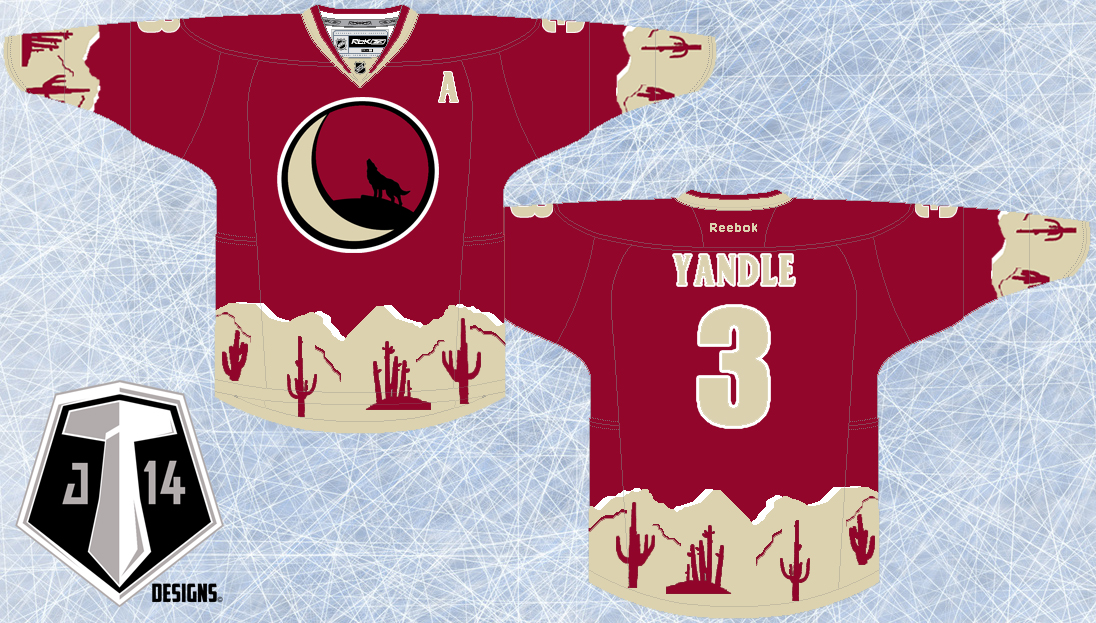
As promised I have come up with a new idea for the Coyotes.  And yes, it is another blending of eras; let's start with the logo.
To make this logo I've taken 3 logos that the Yotes have used in their past and blended them all together to pay homeage to the history of this team.  In the foreground I've taken the original Coyote head logo back from the late 90s and updated the colour scheme.  Then, I've encircled this logo with one that the Coyotes currently have in their arsenal minus the giant paw in the middle.  And just to add a little more depth I've taken the state of Arizona logo thats used as a shoulder patch and faintly put it in the background.
The jersey design itself is yet another shout out to the past.  In fact I've taken the Coyotes original home/away jersey and updated it to fit the modern look they rep now.  I'm not quite sure what 8-bit original Nintendo pattern is supposed to be but hey, it's all good!

New Coyotes Alternate Logo:


New Phoenix Coyotes 3rd Jersey:


Thursday, 25 July 2013

Rebrand Series: Phoenix Coyotes

SURPRISE!!! Happy Thursday: I'll be on a Safari all weekend so I figured I'd give you guys a post today while I have internet access.
Now there is a disclaimer and that is to tell you that half of this concept you have seen before.  When I was trying to come up with ideas for some new Coyotes jerseys I kept coming back to the original concept I posted a long time ago.  The thing was, to me, something looked off in that concept.  With much thought a deliberation I realized that I didn't like the shade of maroon that I used and so I decided that I'd give the same concept another try with a deeper hue of maroon.
That being said I've also created an away jersey with the same design which hasn't been seen yet so although this post is kind of an update on an older design I hope I've made it up to you by giving you an away jersey as well.
And maybe a little teaser about the 3rd jersey I'll be posting next week: It will be another blending of eras much different than the home and away jerseys I've created but just as cool.

New Coyotes Logo:


New Phoenix Coyotes Home Jersey:


New Phoenix Coyotes Away Jersey:


Monday, 22 July 2013

Rebrand Series: Canucks 3rds

I am currently in South Africa for 5 weeks and internet is not as readily available as I'm used to so, I apologize for the lack of posts in the last 2 weeks.

This past season the Canucks brought back a maroon Millionaires jersey which I thought was pretty awesome.  This jersey inspired me to create my own version of this jersey to fit in with the rebranding efforts I've made for the Canucks.  First off, the Canucks need a green jersey, the lack of green in the NHL is a travesty and thus, there really wasn't an option, the jersey had to be green.  additionally I've added a blue trim to the white sleeve stripes.
Finally, I've wanted to add that Lumberjack logo that the Canucks use on their merchandise but never knew how, until they unveiled the millionaires logo they'd be using.  As a result, this is what I've come up with:

New Canucks Alternate Logo:


New Vancouver Canucks 3rd Jersey:


Monday, 8 July 2013

Rebrand Series: Vancouver Canucks

When I took on the challenge of Rebranding the Vancouver Canucks I had no idea what I was going to do, or where I was going to start.  Initially, I grabbed the black, red, and yellow logo the Canucks used to use back in the 90s and simply changed the colour scheme to the Canucks present colours.  I was satisfied, It looked sharp, it was simple and I felt people would love to see me bring back the retro logo.  But something wasn't sitting right for me, I felt as if I was taking the easy way out by not actually creating my own logo.  As a result I sat on this mystery for many months with no progress and then one day it just dawned on me; if I do this properly, I can incorporate the Canucks current whale logo into the beloved 90s logo, and so the task began.  I took a long time to perfect the blend but I'm very happy with the result.
The jersey design itself has a couple different elements going on too.  First, I took the striping on the bottom of the jersey from the throwback jersey the Canucks have worn on several occasions in the last couple of years.  Secondly, and most notably I've given the Canucks slanted lines on the sleeves and taken a chunk of the line out with the idea that the absence of line forms a V for Vancouver within the design.  Overall I think it turned out pretty sweet, I'm especially proud of the logo:

Canucks New Logo:


New Vancouver Canucks Home Jersey:


New Vancouver Canucks Away Jersey: