Saturday, 23 February 2013

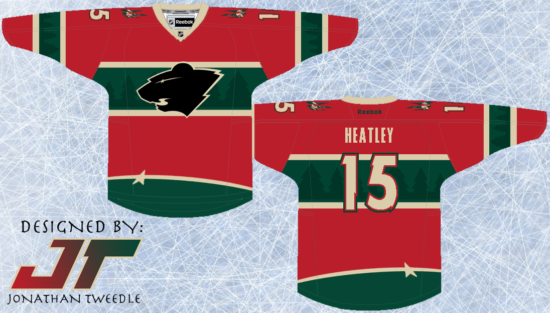
Rebrand Series: Wild 3rds

I guess you could say this type of concept is starting to become my trademark.  I don't know what it is about this type of design, but I think it looks awesome.  It looks, classic, slick, clean, but unique and modern as well.
I've taken the elements from the current wild logo and put them into the jersey design.  The trees accenting the green parts of the jersey and the Star that forms the eye of the logo at the bottom of the jersey to add just another element of uniqueness to this concept.  Finally, I've created a black version of the current Wild logo because, well, because it looks pretty sweet...hopefully.

New Minnesota Wild 3rd Jersey:


Thursday, 14 February 2013

Rebrand Series: Minnesota Wild

This concept is Wild, straight up! this logo is one of the first I created when I decided to rebrand the entire NHL.  I've been sitting on it for a while now, uncertain of how I should go about making a jersey fit for the logo.
I completely understand that both the logo and the concept are out in left field, but with a nickname like the WILD, why not attempt to give some real meaning behind the name with a logo and jersey set that match the name.
The logo is meant to strike fear into opponents, with 2 glaring eyes staring at you through the scratch marks, and the WILD text just so you don't forget who you're afraid of.
With a logo that is so primal, I had to design a jersey set that matched the logo's intensity.  Overall I wanted the jersey to look like it had just been attacked by the very beast I was trying to portray with the logo.  That being said, I didn't want it to look tacky and random, which I why I struggled with the jerseys for so long.  In the end, I tried to capture the essence of a classic hockey jersey but on the edge of crossing that line.  Finally, you will notice that the Wild away jersey is beige not white.  Simply put the Wild own that beige look, and the white just doesn't look right.

New Wild Logo:


New Minnesota Wild Home Jerseys:


New Minnesota Wild Away Jerseys:


Friday, 8 February 2013

Rebrand Series: Oilers 3rds

Originally, I was going to use this logo as the primary mark for my rebranded Oilers designs.  When my creative juices finally started flowing I replaced the spawn logo with a creation of my own, but I knew I had to bring it back in some capacity.  The Spawn logo is easily my favourite of all the Oilers logos and all I've done is change the colours to match the orange and navy colour scheme used for this new 3rd jersey I've designed.
The jersey design is nothing complex, but the simplicity is what makes it stand out for me.  I brought back the Oilers navy that they rocked before the throwbacks became their primary, but instead of going with the bronzy orange, I used the throwback orange with really makes the colours pop on the jersey.  Kind of a simple design, but I hope you guys like it.

Updated Spawn Logo:


New Edmonton Oilers 3rd Jerseys:


Saturday, 2 February 2013

Rebrand Series: Edmonton Oilers

When I was designing a jersey and logo for the Oilers I originally decided to just take the "Spawn" logo that the Oilers used on their 3rds prior to the Reebok edge era and change the colours to reflect the Oilers current palette.  Everything was all good, logo fit and I designed the jersey to pay tribute to 3 different styles the Oilers have worn in their past.
The striping on the jersey is inspired by the striping from the jerseys the Oilers wore just prior to the Reebok edge era.  In addition to the stripes I've taken an element from the Reebok edge jerseys in which the arm stripes only go up half way, giving the jersey a little more of a modern look.  Finally, and quite simply I've used the Oilers retro colour scheme because, to be honest, the colour scheme they used before was pretty dull.
I was ready to post the jerseys a while ago, but for some reason I hesitated because I felt like i was copping out by not actually designing my own logo.  So, last week I was finally hit with an idea, which has finally materialized into a logo I'm proud to post.  In the foreground is an oil drill, the element I was struggling with for the longest time, but I finally found on that fits into the look of the design.  I then layered the Oilers current text mark over top of the drill, and put the Edmonton skyline in the background.  Finally, the shape of the border was loosely inspired by the Oilers AHL affiliate the Oklahoma City Barons.

New Oilers logo:


New Edmonton Oilers Home Jersey:


New Edmonton Oilers Away Jersey:


Monday, 28 January 2013

Rebrand Series: Rangers 3rds

As promised I've created a new alternate logo for the Rangers using the Liberty Torch.  When working on this logo I played around with a few different ideas; first off I left the torch by itself but I looked like something was missing, then I put a silhouette of the head of lady liberty but didn't get positive feedback on it, finally I put the modernized Rangers shield as the background and there you have it.
The jersey is a combination of 2 jerseys the Rangers have used in the past with a twist I've added on my own.  Most obviously, the bottom stripes are inspired by the home jerseys the Rangers currently use and have used since the beginning of time it seems like.  The arm stripes are a version of the stripes used on an alternate the Rangers used from 96-07, but I've switched the colours.  Finally, as inspired by the shield used in the logo, I've put a zigzag pattern on both sets of stripes to make it consistent with the jersey.  I've brought back the "classic" Rangers blue and red and although I'm not 100% sold on the jersey design, I can definitely see it growing on me.

New Rangers Alternate Logo:


New New York Rangers 3rd Jersey:


Friday, 11 January 2013

Rebrand Series: New York Rangers

I've gotta say, this new logo is, I believe my best work.  I've been waiting so long to unveil this jersey set to you guys but for the longest time I couldn't get a jersey design that did justice for the new logo.  As you can see that inspiration didn't happen until the world juniors were on.  As much as it pains me to say as a Canadian, the team USA jerseys are sweet, I love the design and as a result I decided to use that design to give my new Rangers logo a proper home.  While the design itself is quite simple, it draws your attention to the important elements of the jersey, it's classic, just like the Rangers history.  Over the years the Rangers have changed their logo and jerseys minimally so I decided it was time for a change.
The first thing you will notice is that the blue used in the jersey is much darker than the "classic" Rangers blue.  I think it just looks better, more intimidating, and it fits better with the logo.  I am working on a 3rd jersey that will definitely pay homage to the "classic" Rangers blue so don't worry.  You might also notice that I've created a new shoulder patch for the team as well, now sporting the liberty torch on both arms, this logo is also in the plans for the 3rd jersey I will be posting next.
Finally, and most importantly take a look at the new Rangers logo.  I can't even tell you how long it took to make this one, many many hours, that's for sure.  But as you can see I've combined the famous Rangers crest with the modern, Statue of Liberty logo they used on a jersey a number of years ago.  But it wasn't enough to just use the shape of the Statue of Liberty, in fact it looked quite tacky at first, which is why I've "burned" the head of Lady Liberty into the logo crest.  The logo is a very modern looking crest and I've done this because it fits the flow of the jersey set much better than a classic crest.  Well, I've already said this my favorite logo I've designed thus far, what do you guys think?

New Rangers Logo:


New New York Rangers Home Jersey:


New New York Rangers Away Jersey:


Friday, 4 January 2013

Rebrand Series: Chicago Blackhawks 3rds

This concept is more of an improvement of an old idea. For as long as I can remember the Blackhawks have had the same shoulder logo; the one with the 2 tomahawks crossed with a C in front of them.  Cool idea, poor execution in my opinion, to me it just feels as if a 5 year old drew this and the team thought hey why not.
The main focus of the new Blackhawks 3rds, is improving that logo.  As you can see all I've done is make that logo look a little bit more intimidating and less cartoony.
The jersey was tough, as with the rebranded home away jerseys I posted a couple of weeks ago.  The Blackhawks jerseys have changed little over the years and so, I decided to go with the same design as their actual home jerseys with the new logo on the chest.
I really like the logo and could definitely see it being used in place of the primary logo:

 New Blackhawks Alternate Logo:


New Chicago Blackhawks 3rd Jersey: